Project Type Programs
Overview
Data Visualization Design Adobe Illustrator
Informational Design Adobe Photoshop
Figma
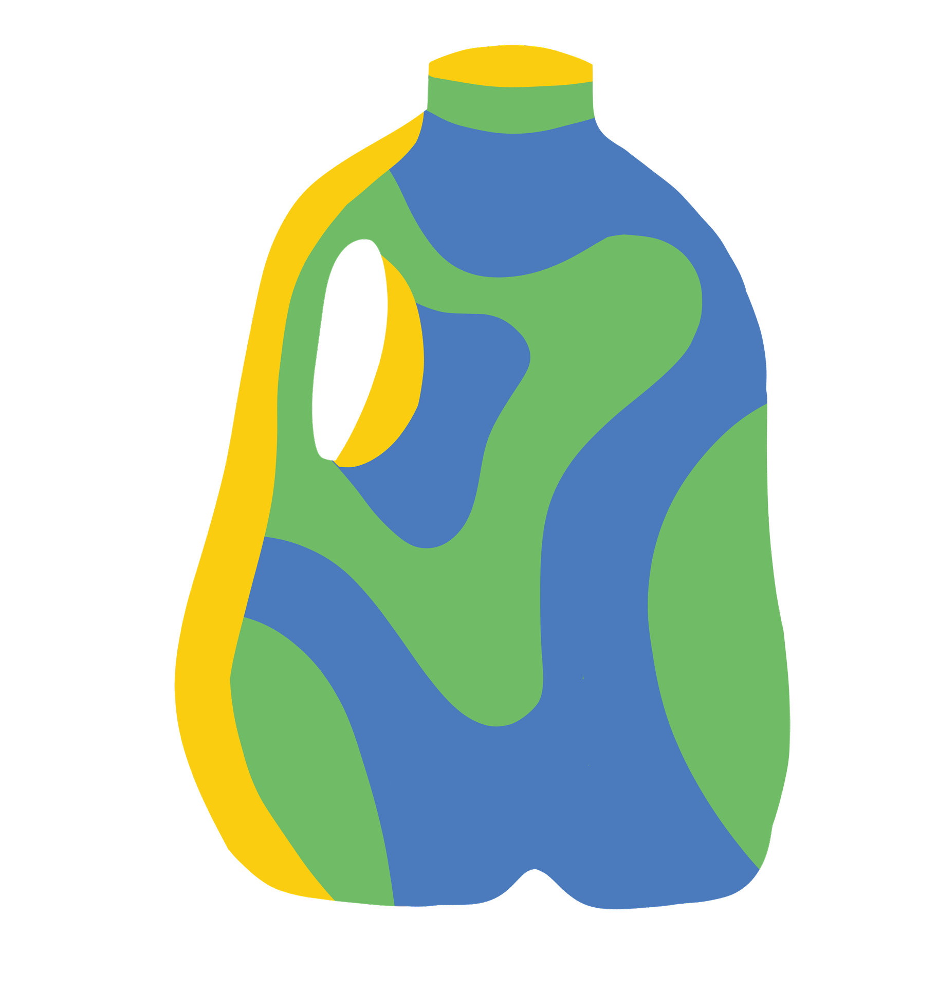
A collaborative infographic poster system design focused on bringing statistically founded educational awareness about recycling in Ruston, Louisiana. My team solved issues focused on AI, MRF process flows, and data analytics made palatable through design.
Collaborators
Karli Swanzy, Graphic Designer
Sarah Monroe, Graphic Designer
Harold Braud, Digital Artist
Payge Fannin, Digital Artist
Taylor Moore, Digital Artist

Our Research
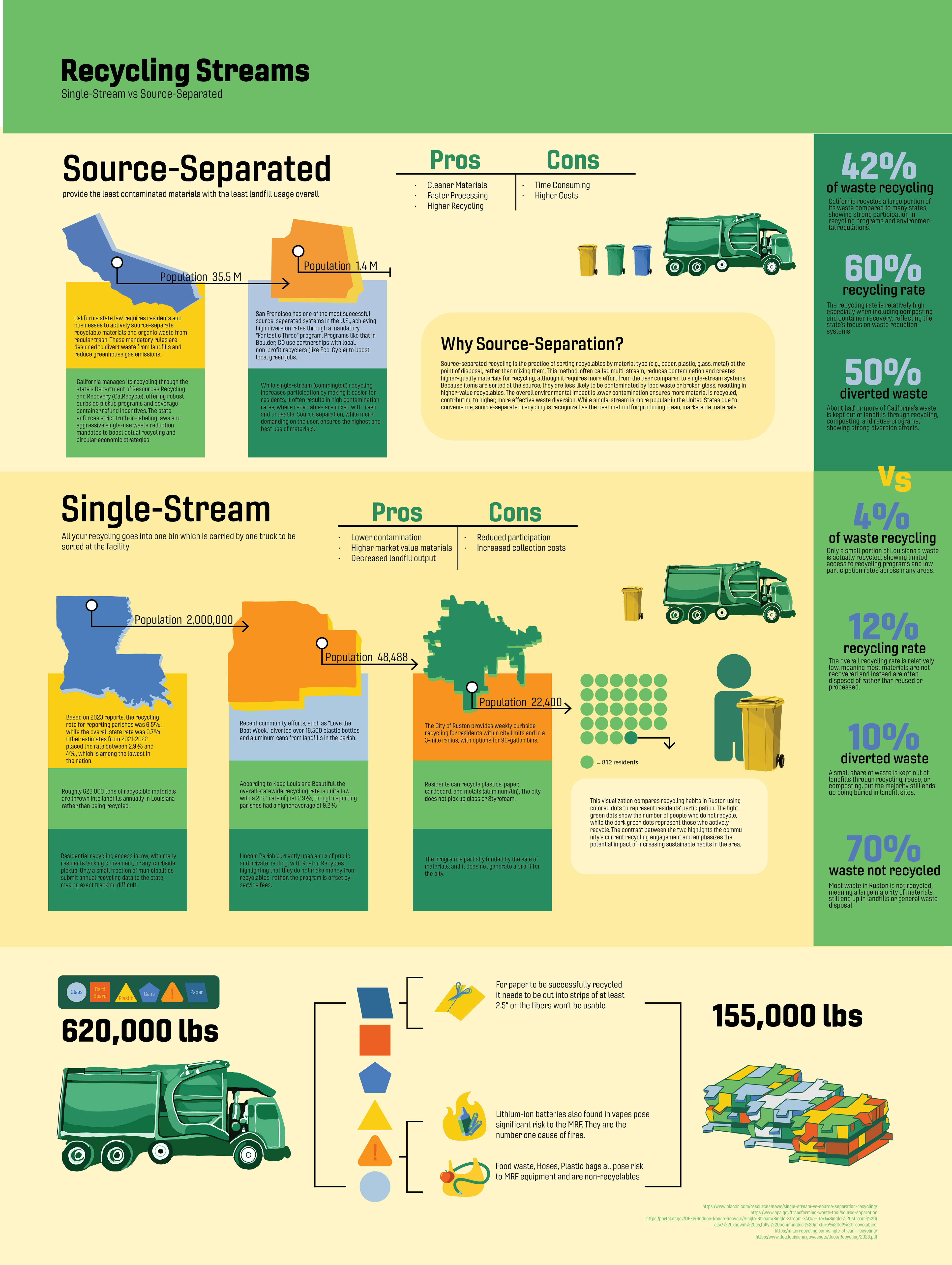
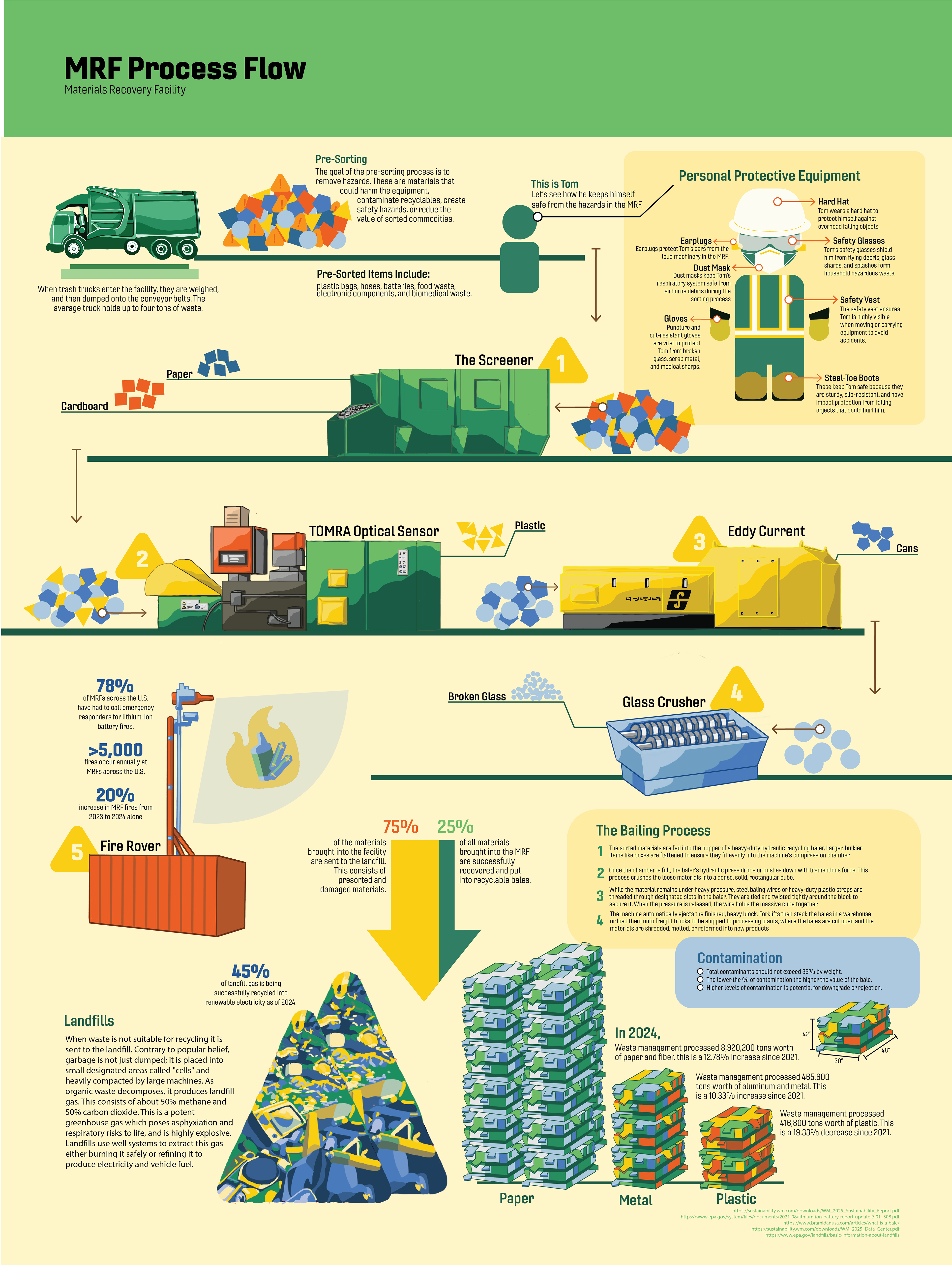
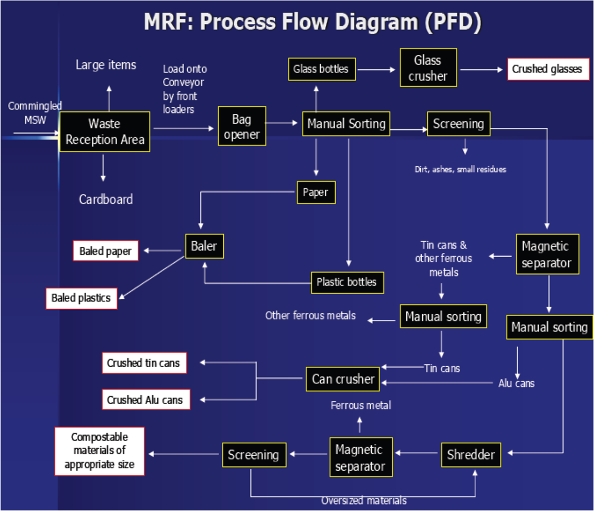
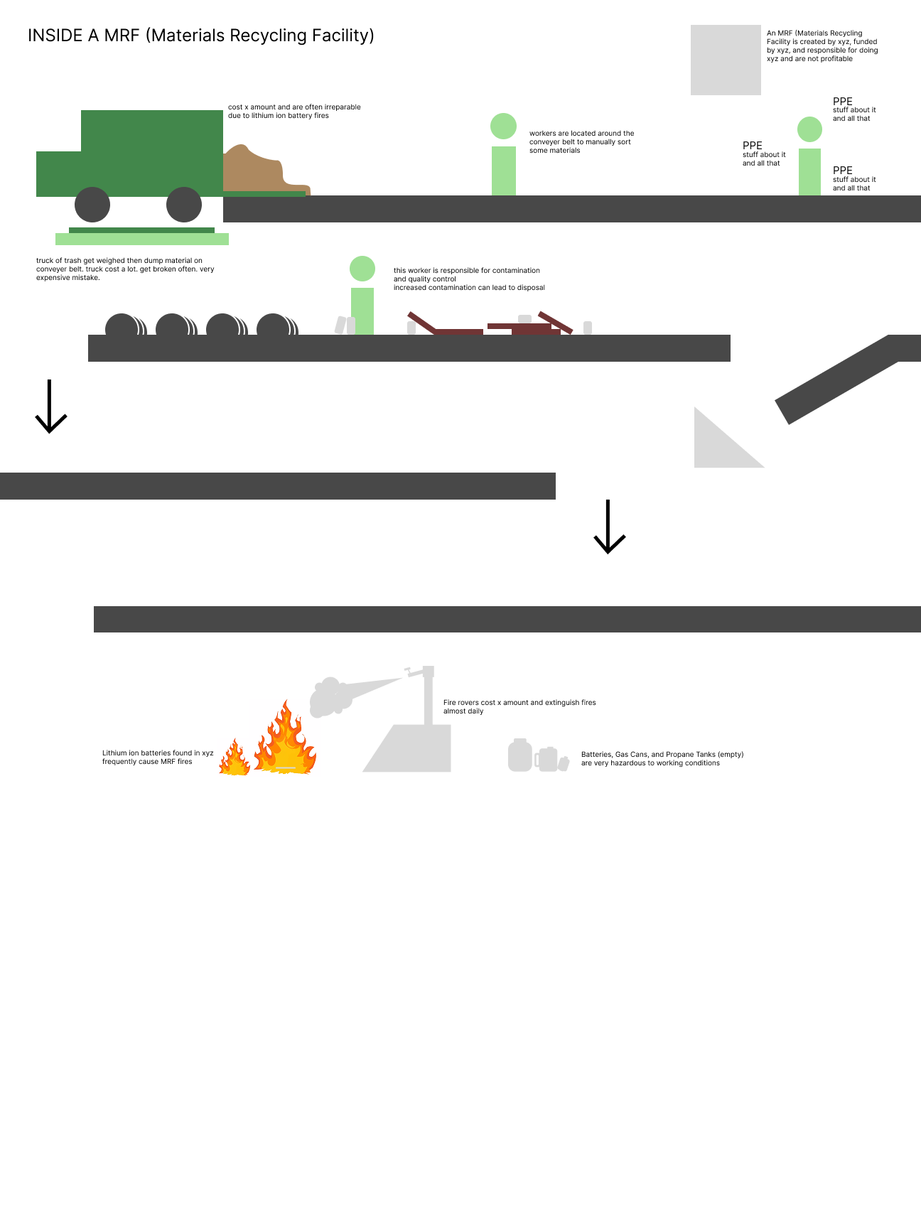
One of the first tasks my graphic design partners and I took on was figuring out what exactly the recycling process was. This was accomplished by delving into JSTOR for academic research, informational videos, diagrammatic process flows, and infographic designs. In short, MRFs (Material Recycling Facilities) are divided into two categories: single-stream and source-separated, which determine the way things are organized before they enter the facility. Recycling used to reduce environmental impact, reduce production costs, , etc. A significant part of the recycling industry is involved in vehicle and building fires and incorrectly sorted/contaminated materials.
Following our research on who Diana is as a person, we wanted to dig deeper to find what inspired her and her brand concept she had at the time. We discovered her culinary career was one she had to realize on her own, but it quickly became her passion as she developed her skills. Regarding her brand, Diana used Canva to create her designs, but it lacked a professional flare and overall cohesiveness. They were colorful, retro-inspired, and had illustrative qualities. The client also went under multiple aliases and a branded phrase called “That’s It!” This information was used to push her brand utilizing her original ideas and improve upon where her previous designs fell short.
Another task was establishing who Diana’s ideal audience was so we could design for that demographic. With the help of our professor and classmates, it was determined our client’s target audience would be open-minded, fun, and food-loving established adults around 25-35 years old. This would become crucial, since my team would have to design something out of our age range.

Our Concept
My team’s goal was to create a fully functional, visually interesting, conceptually cohesive, and data-backed infographic poster system for the City of Ruston, Louisiana, in 8 weeks. The topics delegated to us were:
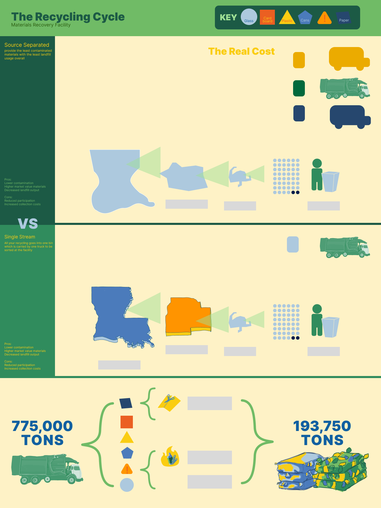
Single-Stream vs Source-Separated Recycling
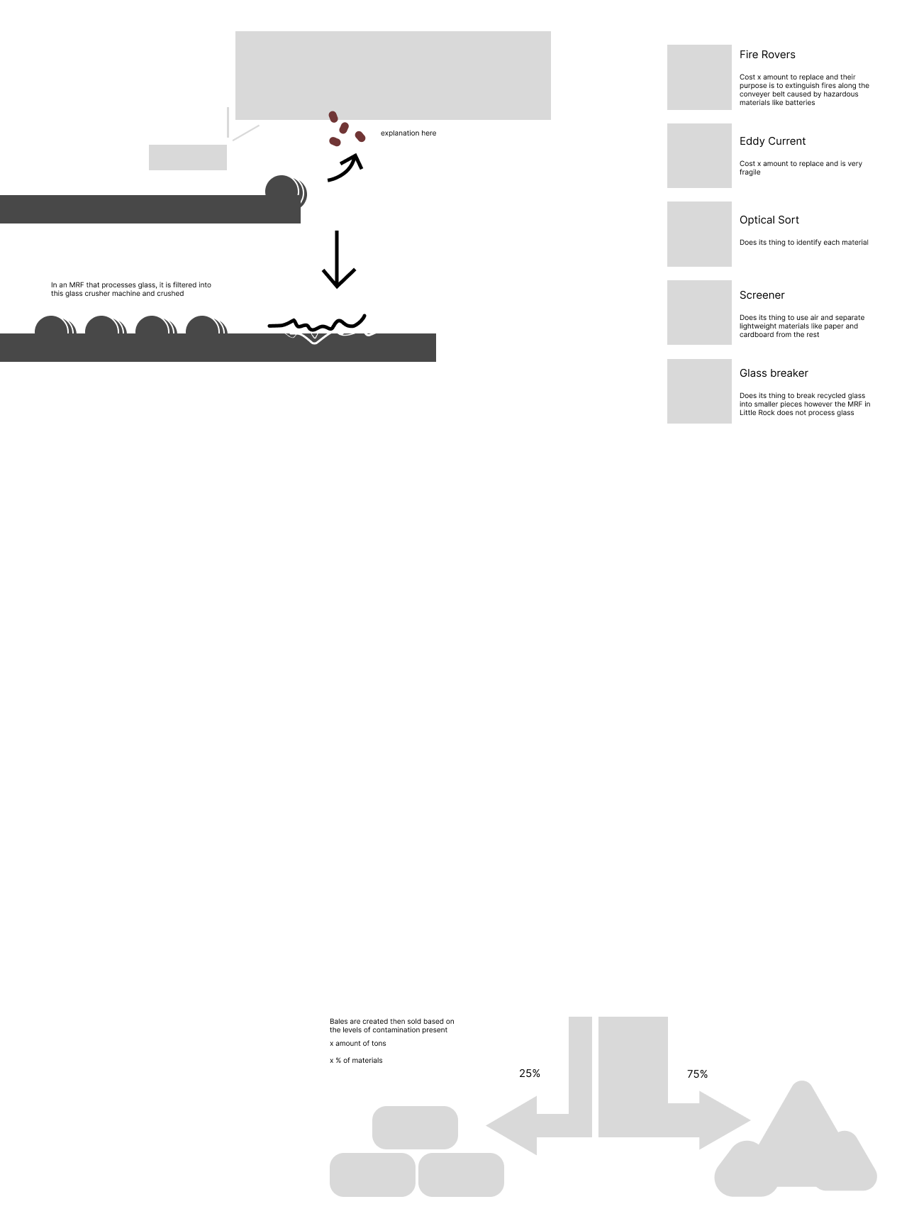
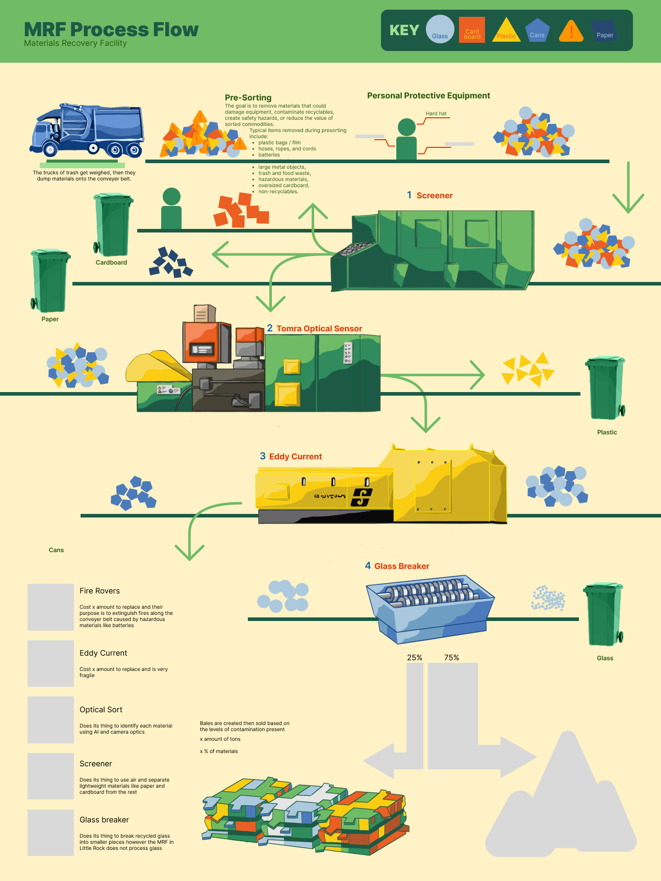
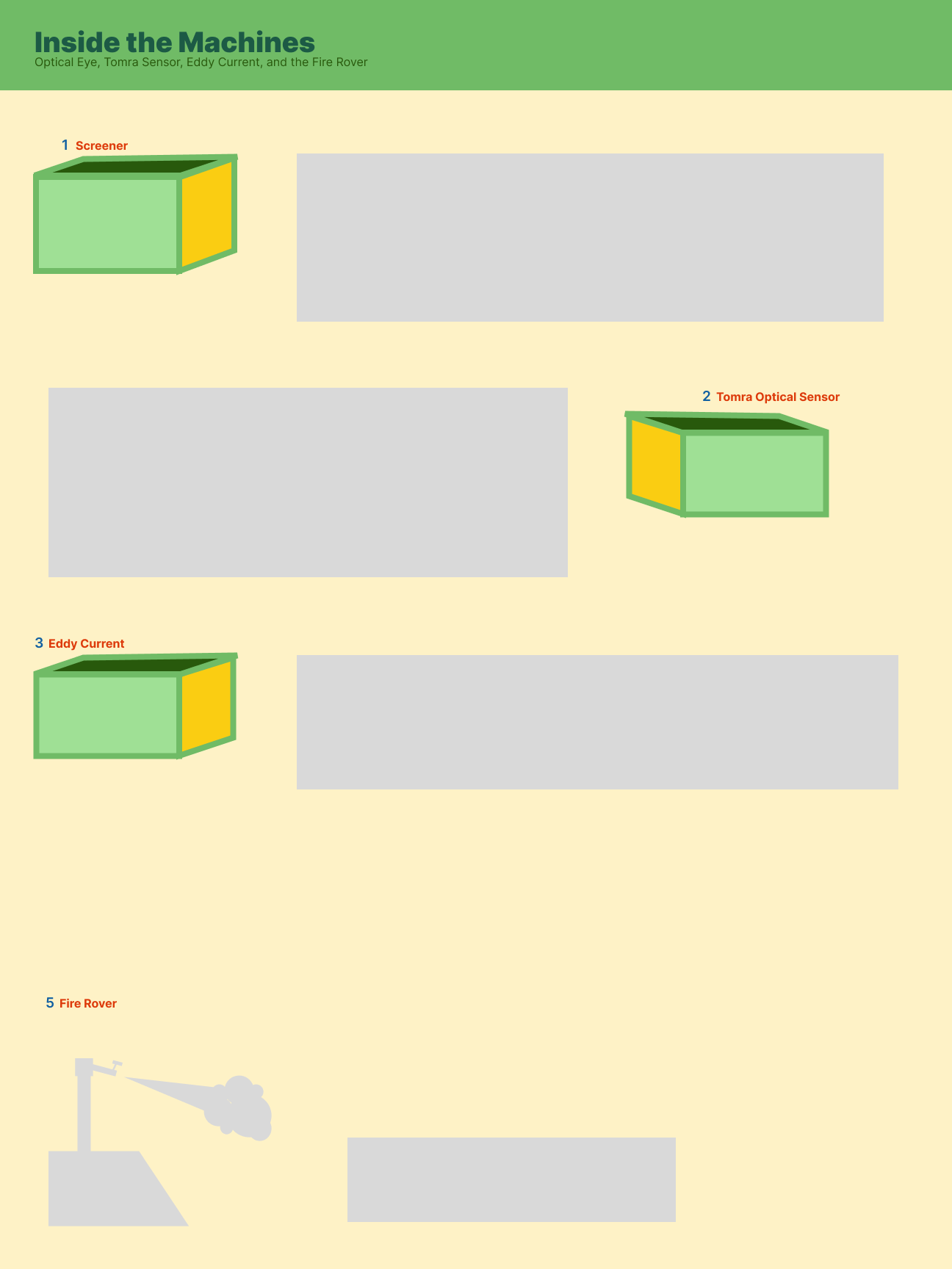
Inside a MRF: Material Recovery Facility process flow
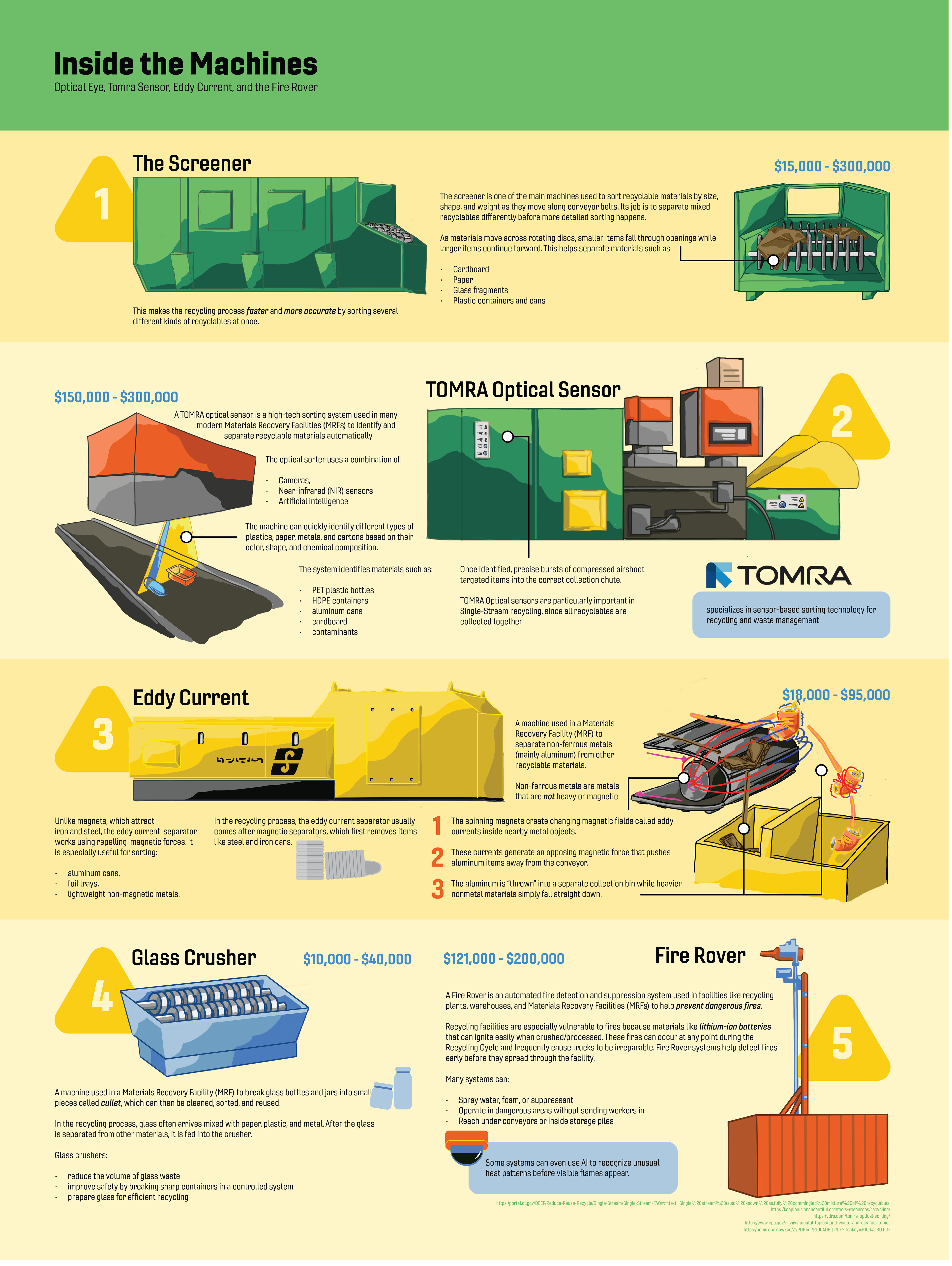
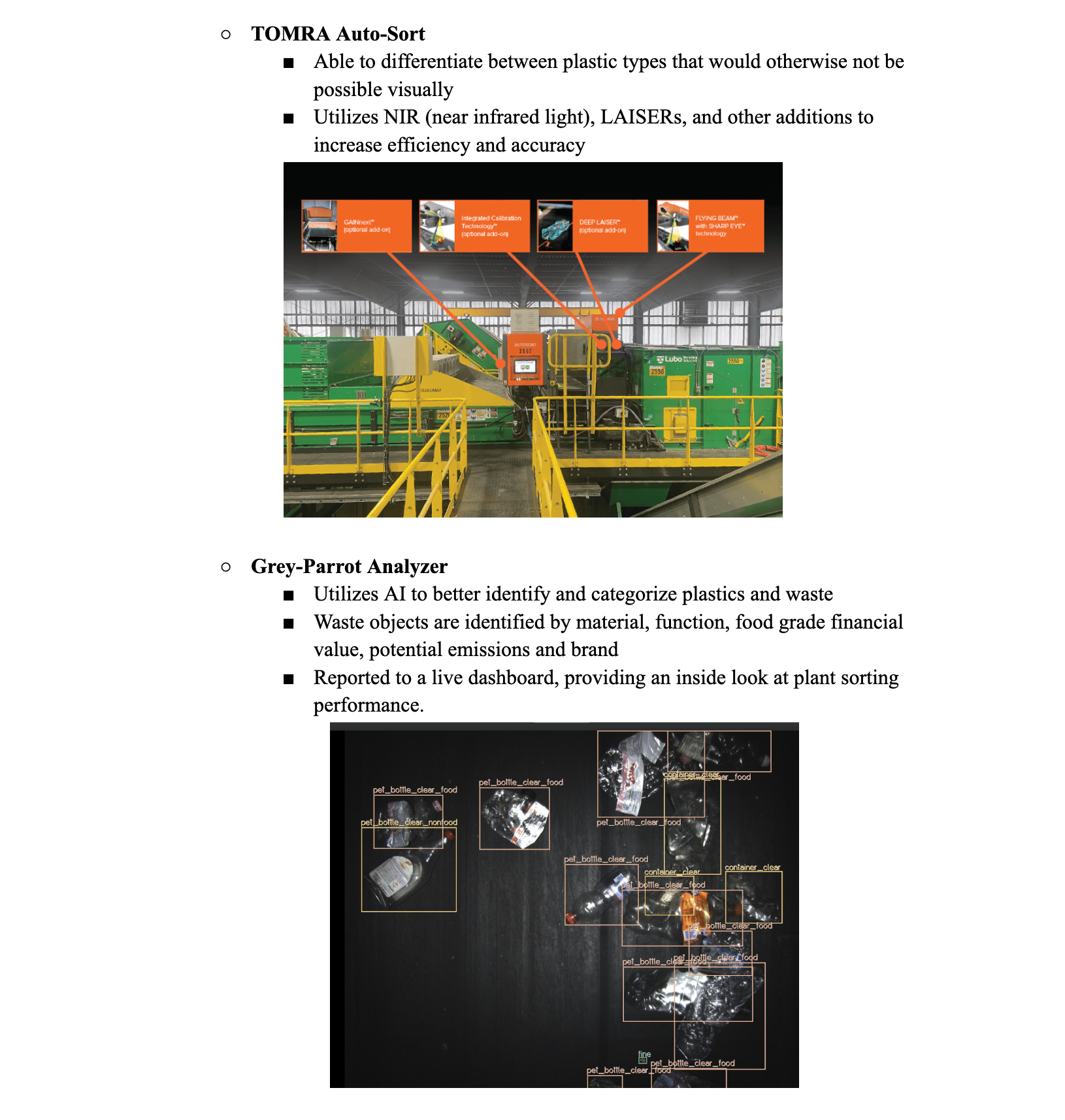
Technology in sorting: optical sensors, AI, and robotics
Following a visit to the Little Rock Recycling Plant for field research, one of our first decisions was determining which questions we wanted to answer on which poster. We also did a lot of research about what a Material Recovery Facility is, does, who it employs, its economic impact, and effectivity. JSTOR was our primary source of scholarly sources. Originally, we planned to have the first poster on single-stream vs source-separated stand alone, while the other two bled into one another, since the MRF process flow and technology were very closely related. The initial sketch was using a conveyer belt as the bridge between the two. During this stage, my team worked solely in a collaborative Figma file, reserving Adobe Illustrator for later in the process.
Following the sketches and research for the poster layout, we discussed typography and color palette briefly. Typographically, my team agreed quickly. Gineso was used for Bodycopy because of its clean and legible nature, while my all time favorite font, Owners, was used for Headings and Subheadings to bring structure and power to the design. Our color palette was inspired by one of my teammate's previous designs falling in line with MRF technology typical colors.
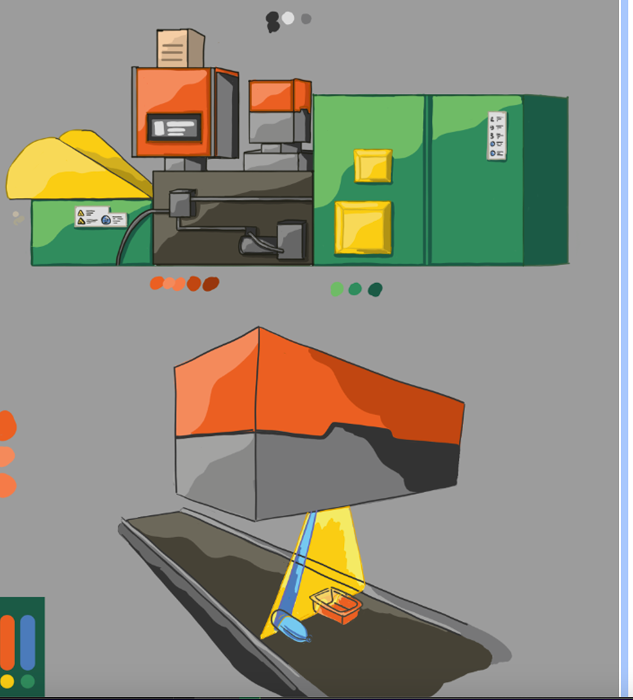
The 3 graphic designers met with the 3 digital artists in my team on a weekly meeting basis while communicating through texts on a daily basis for the entirety of the project. Some of the preliminary artistic designs showcased were cohesive and derived from a style-guide we 3 graphic designers gave them. One of our artists was also a mechanical engineer, which enabled us to progress quickly with intricate, complex, and detailed machinery designs.
Our Process
After receiving polished stylized designs, my team continued to deep dive into recycling. This process came with a little more structure, and although rudimentary, these designs gave us the foundations for our finalized posters.
Much of my team's time was spent in Figma, collaborating, and later in Adobe Illustrator aligning type, maintaining visual hierarchy & style, and rearranging compositions. At this stage, I was responsible for research and layout design of poster 3, most of poster 2, and some of poster 1. Since my poster was the most simplistic and straight-forward, I was a "floater," doing what was necessary at that moment.
During the few days prior to finalizing, the 2 other graphic designers and I met after hours to polish our design in person. We were all independently using a shared Adobe Illustrator file I set up until this point to ensure layouts and grids did not shift unknowingly. This last meeting was critical to the success of our designs.
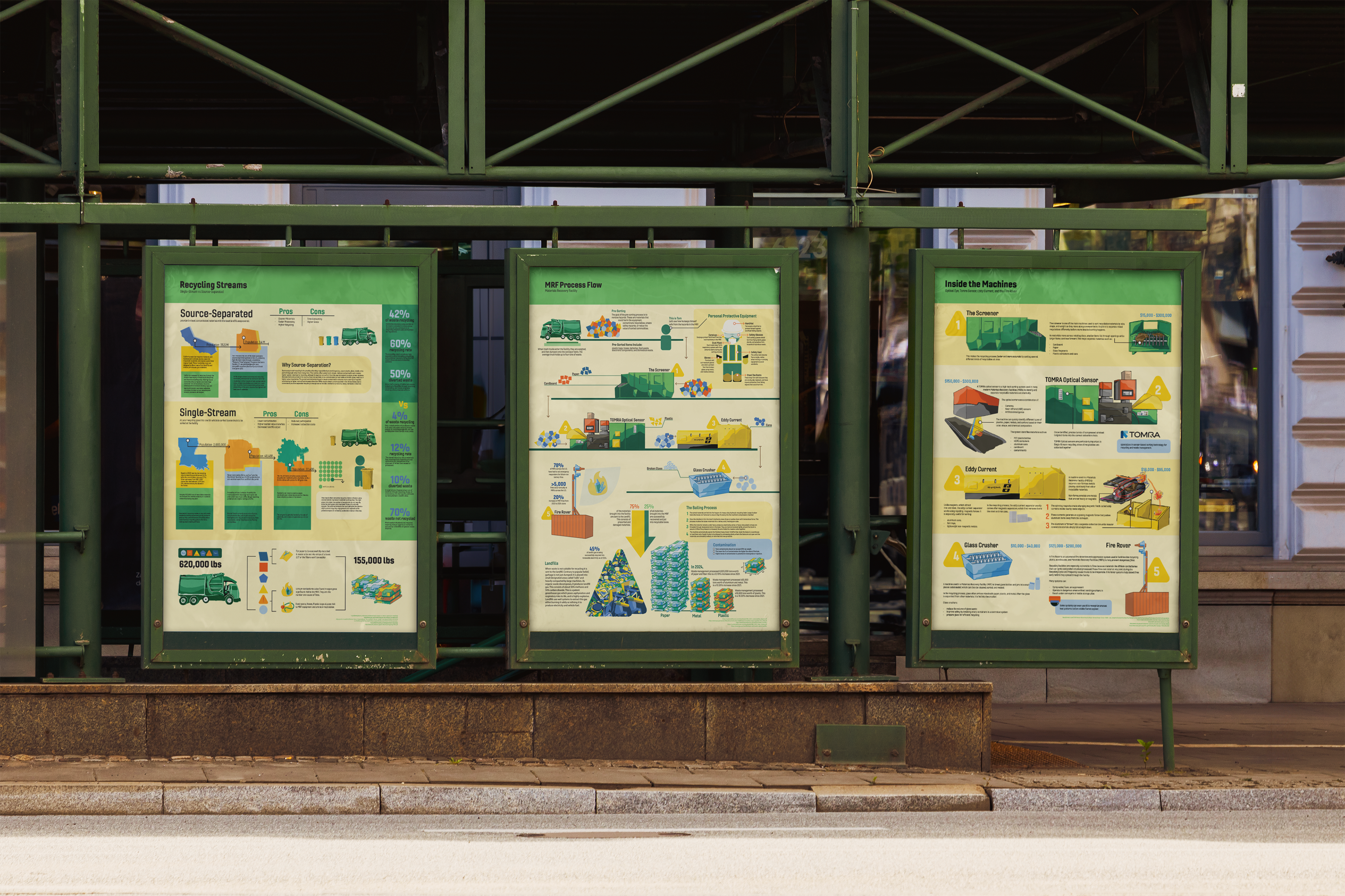
Our Product
Our deliverables consisted of 3 posters designed to be displayed together, complete with print-ready design files. Our statistical data and research was cited in the bottom.
Although I helped design all 3 posters in various stages, I was responsible for
layout design of Poster 1
Preliminary research
ensuring visual/stylistic consistency and the entirety of Poster 3.