Project Type Programs
Overview
Brand Identity System Adobe Illustrator
Web Design Adobe Photoshop
Figma
A collaborative identity system design focused on established adult foodies with a taste for the unique and experimental. My team solved brand issues regarding cohesiveness, consistency, and professional appeal.
Collaborators
Kyle Washington, Graphic Designer

Our Research
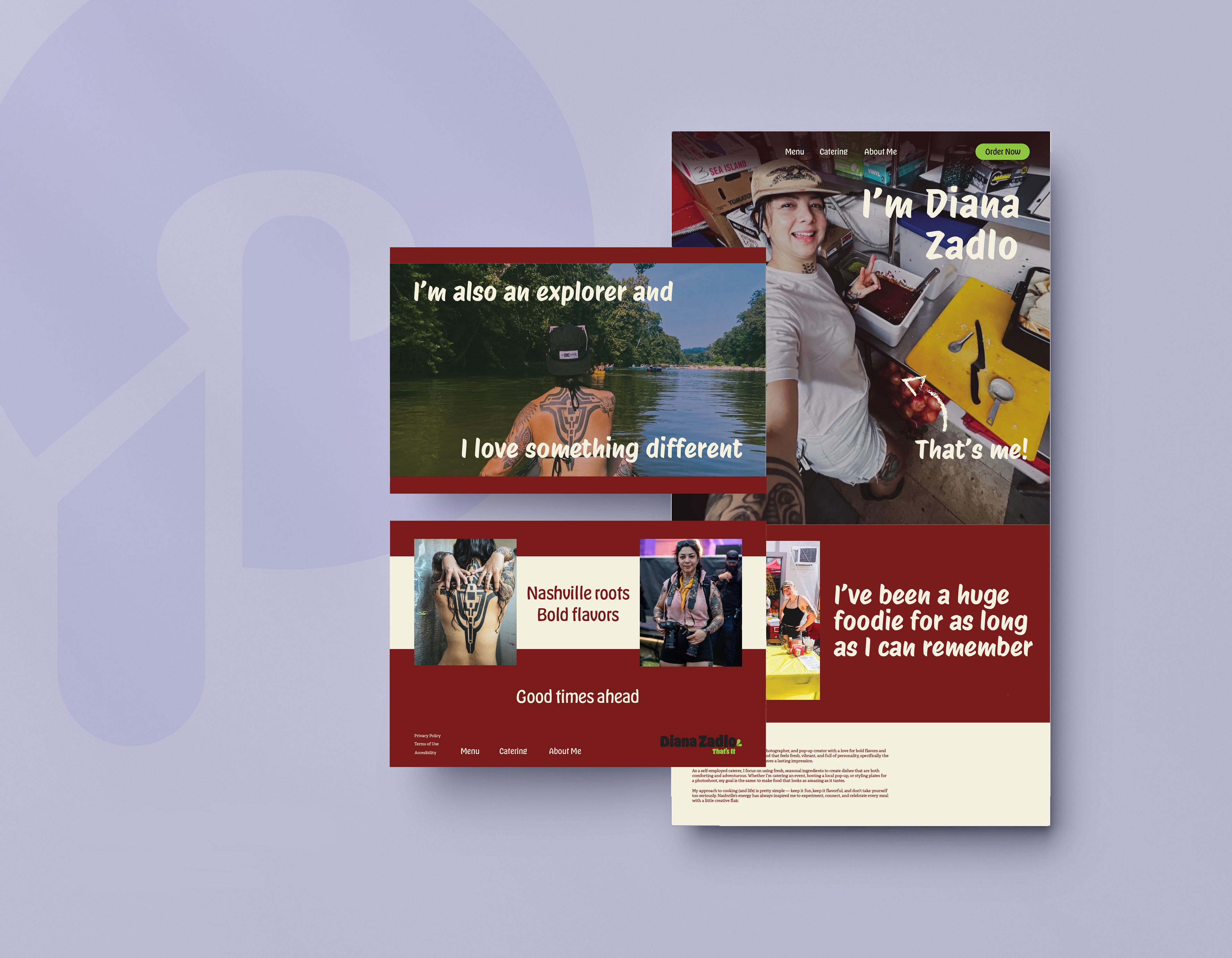
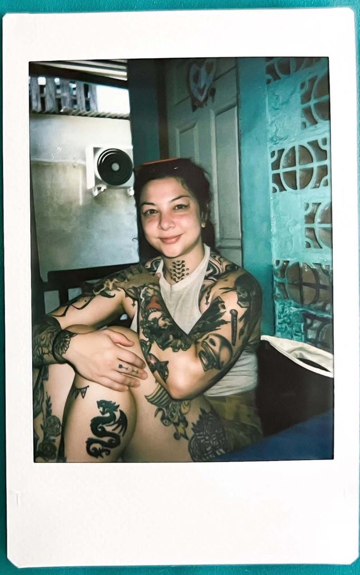
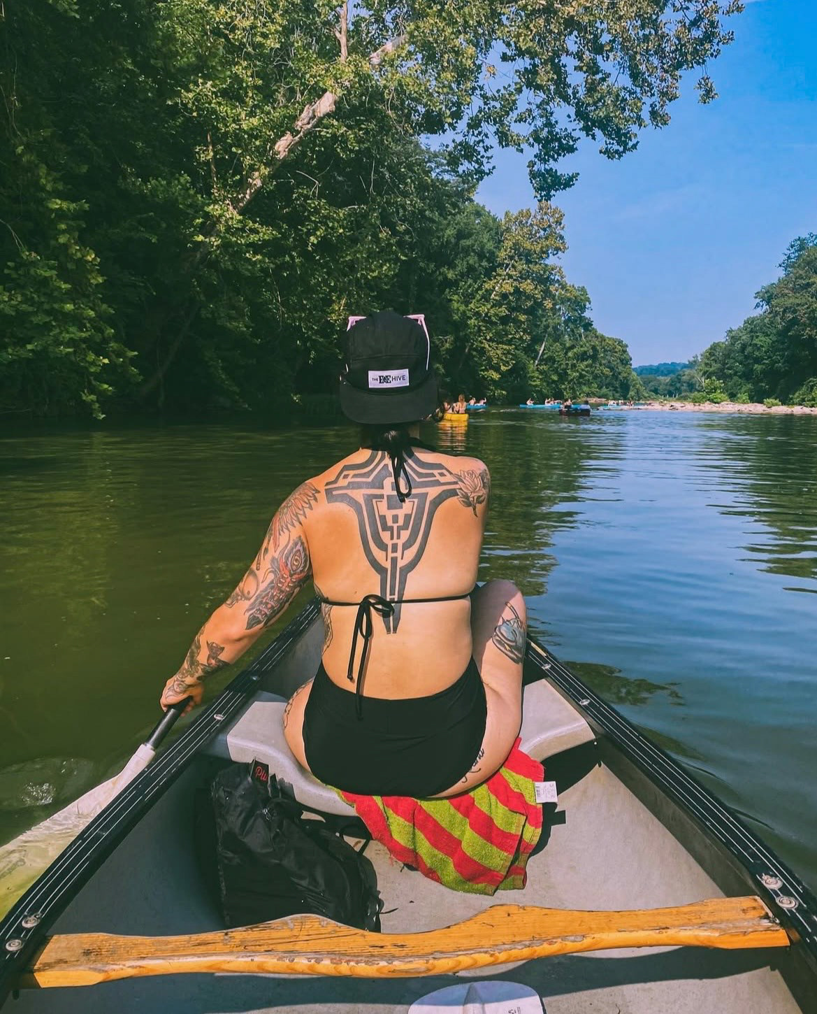
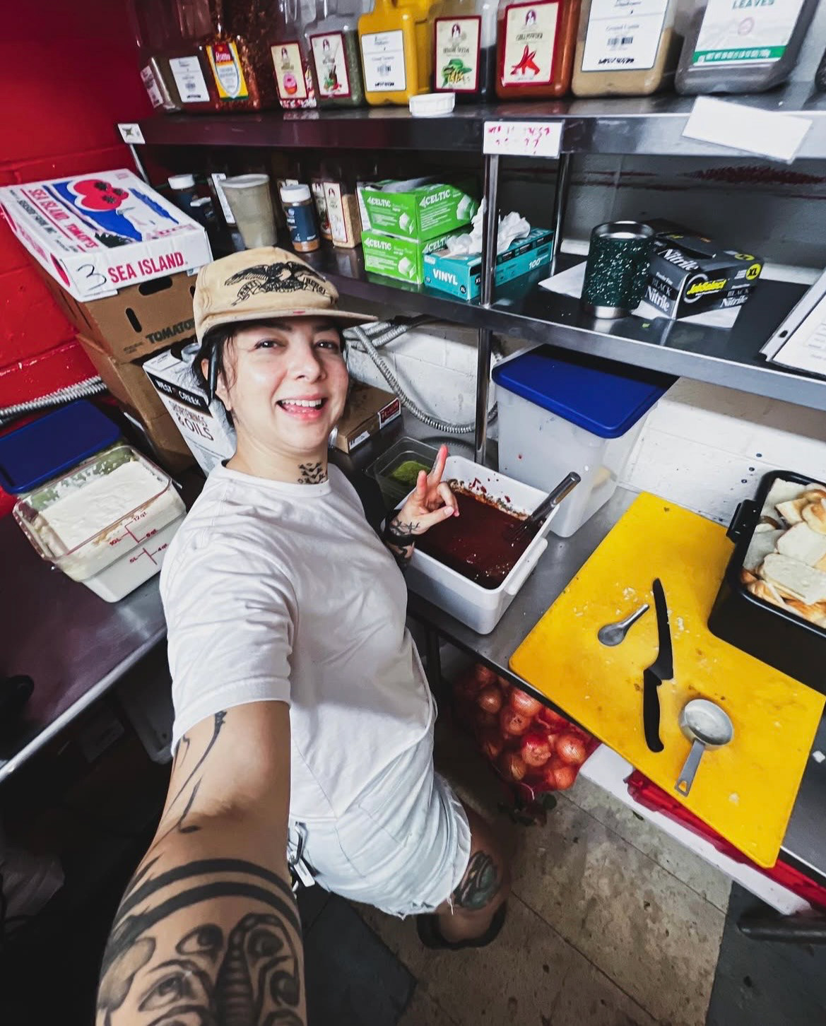
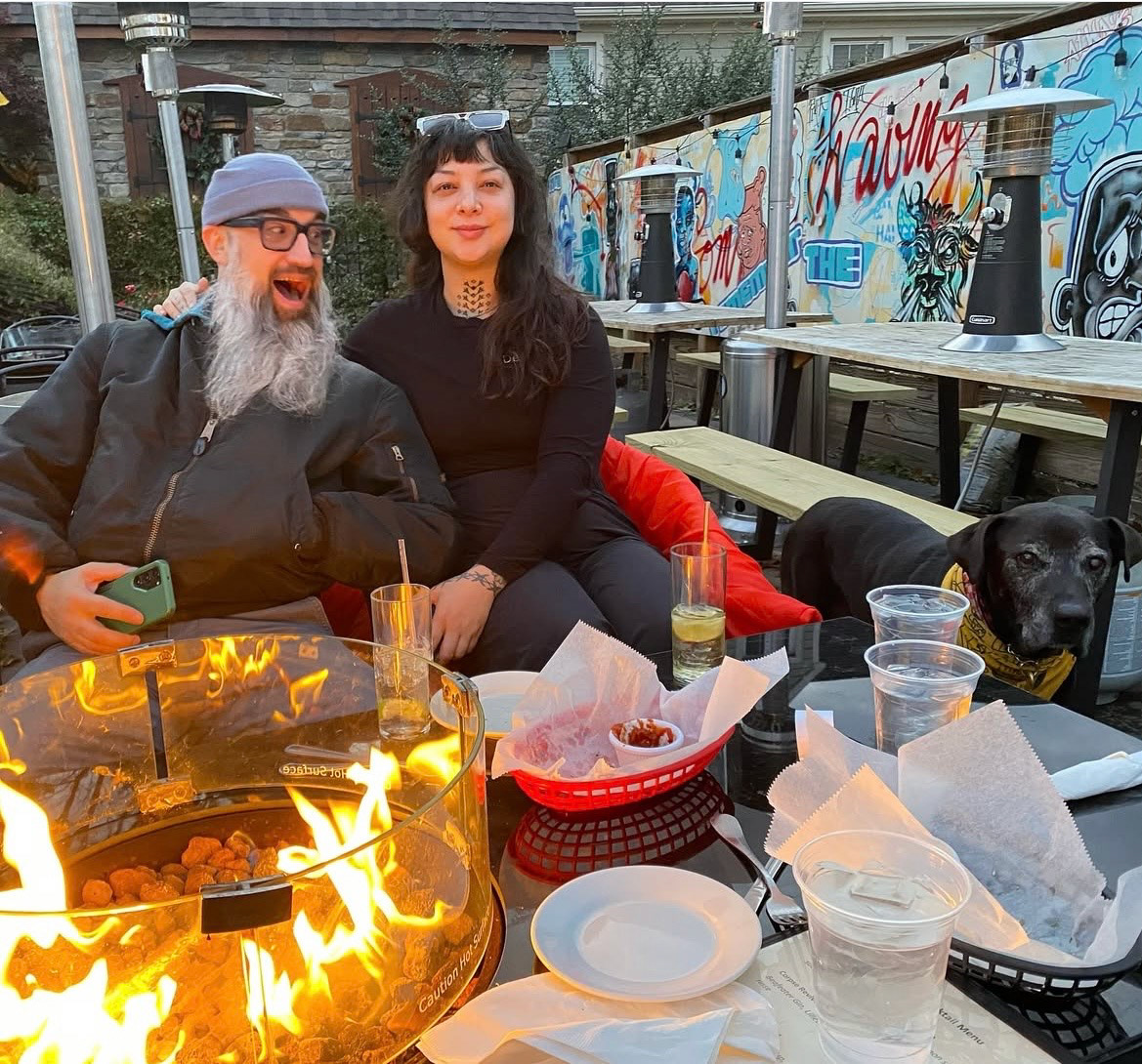
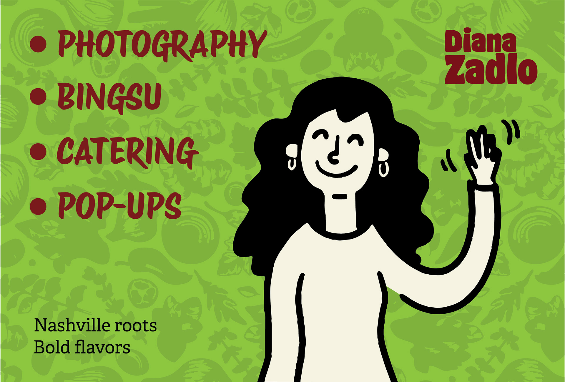
One of the first tasks my graphic design partner, Kyle, and I took on was figuring out who exactly Diana Lee Zadlo was. This was accomplished by delving into her social medias, videos, current website, and brand assets. In short Diana is a Nashville-based culinary pop-up artist with alternative style who has a passion for unique, experimental, and innovative flavors from around the world. A significant part of her career is also food photography and catering events.
Following our research on who Diana is as a person, we wanted to dig deeper to find what inspired her and her brand concept she had at the time. We discovered her culinary career was one she had to realize on her own, but it quickly became her passion as she developed her skills. Regarding her brand, Diana used Canva to create her designs, but it lacked a professional flare and overall cohesiveness. They were colorful, retro-inspired, and had illustrative qualities. The client also went under multiple aliases and a branded phrase called “That’s It!” This information was used to push her brand utilizing her original ideas and improve upon where her previous designs fell short.
Another task was establishing who Diana’s ideal audience was so we could design for that demographic. With the help of our professor and classmates, it was determined our client’s target audience would be open-minded, fun, and food-loving established adults around 25-35 years old. This would become crucial, since my team would have to design something out of our age range.
Our Concept
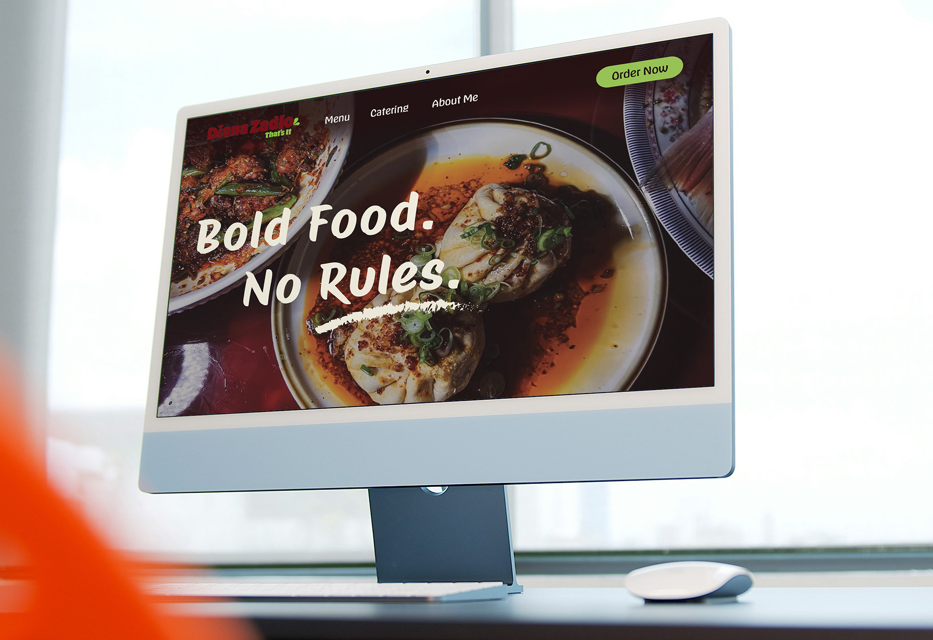
My team’s goal was to create a fully functional, visually interesting, conceptually cohesive, and unique for our client, Diana Lee Zadlo, in 4 weeks.
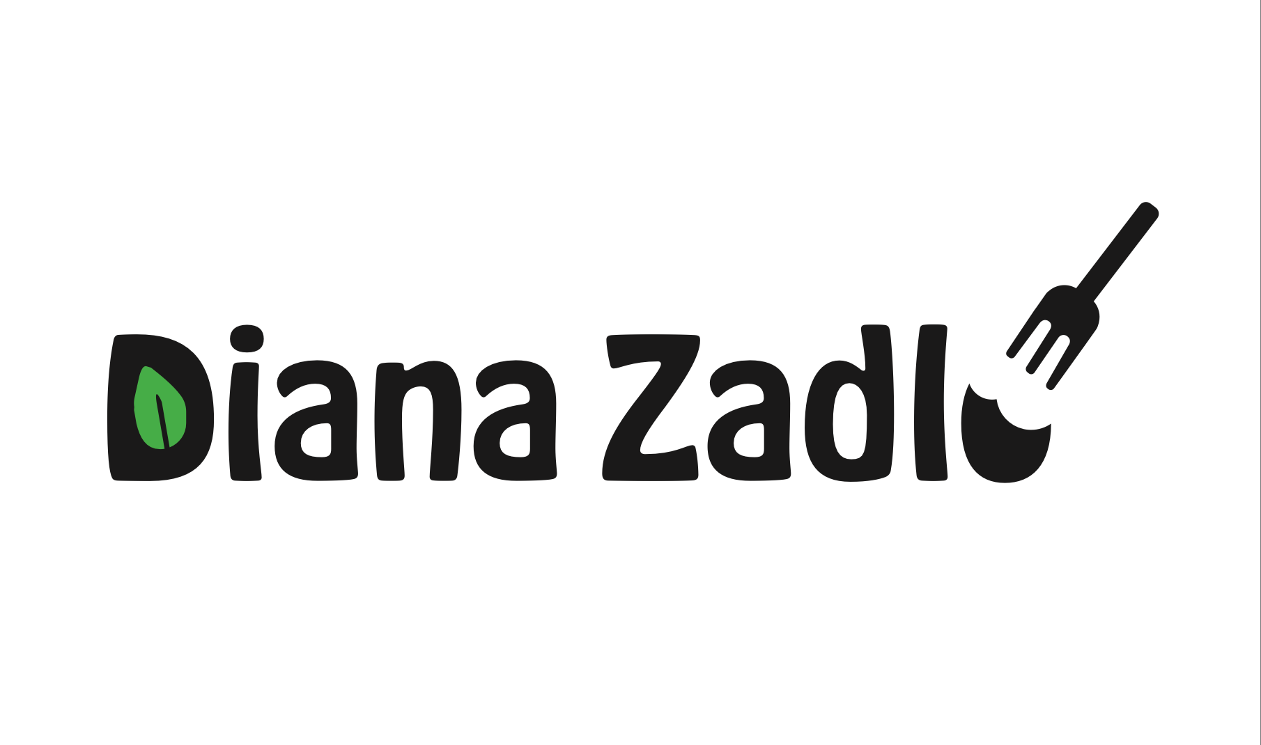
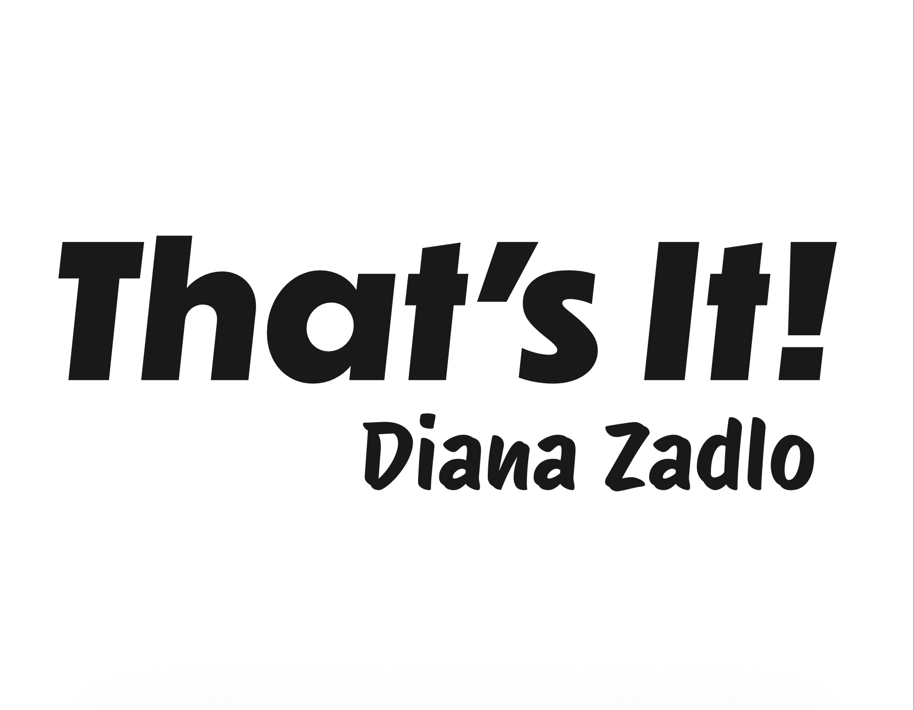
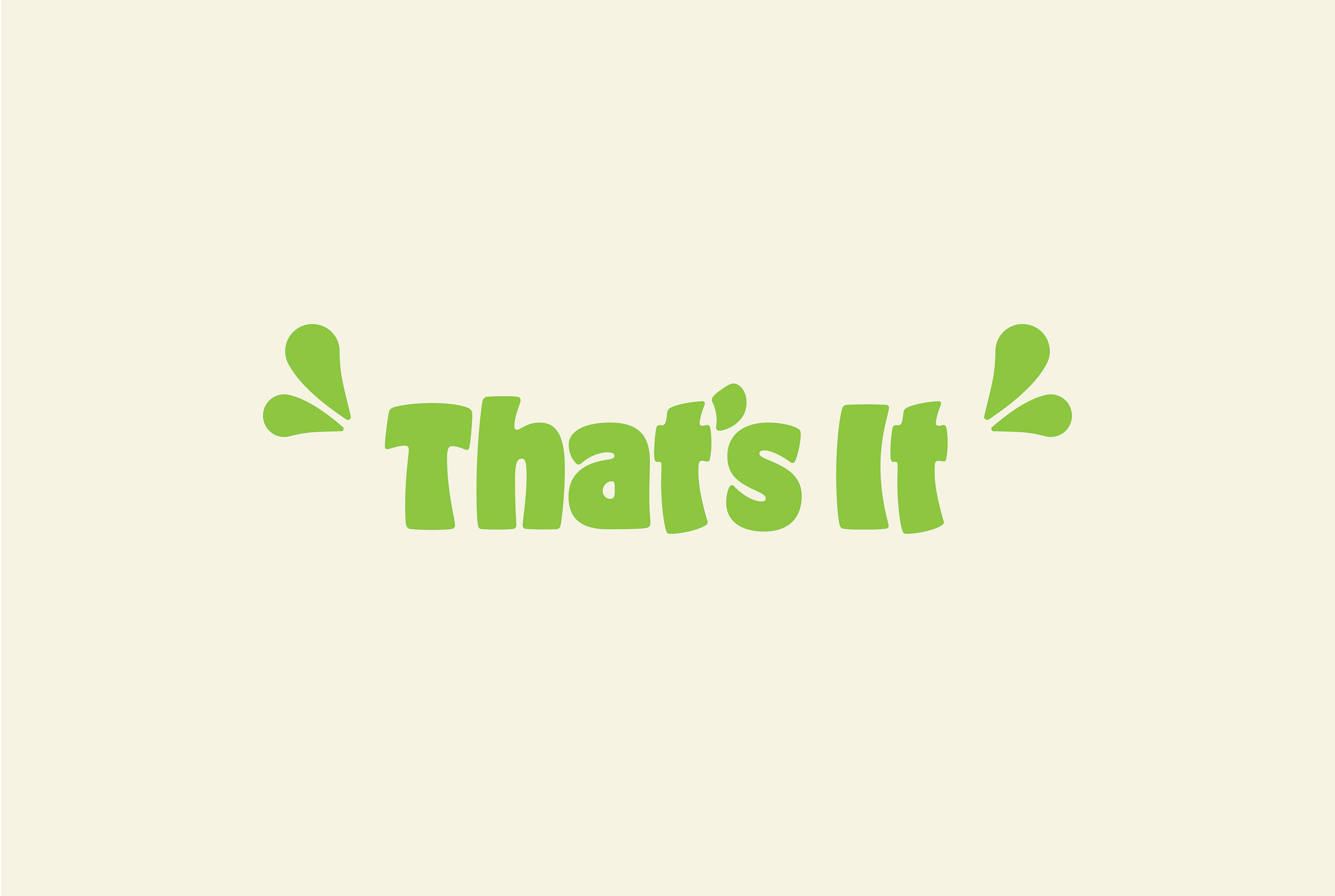
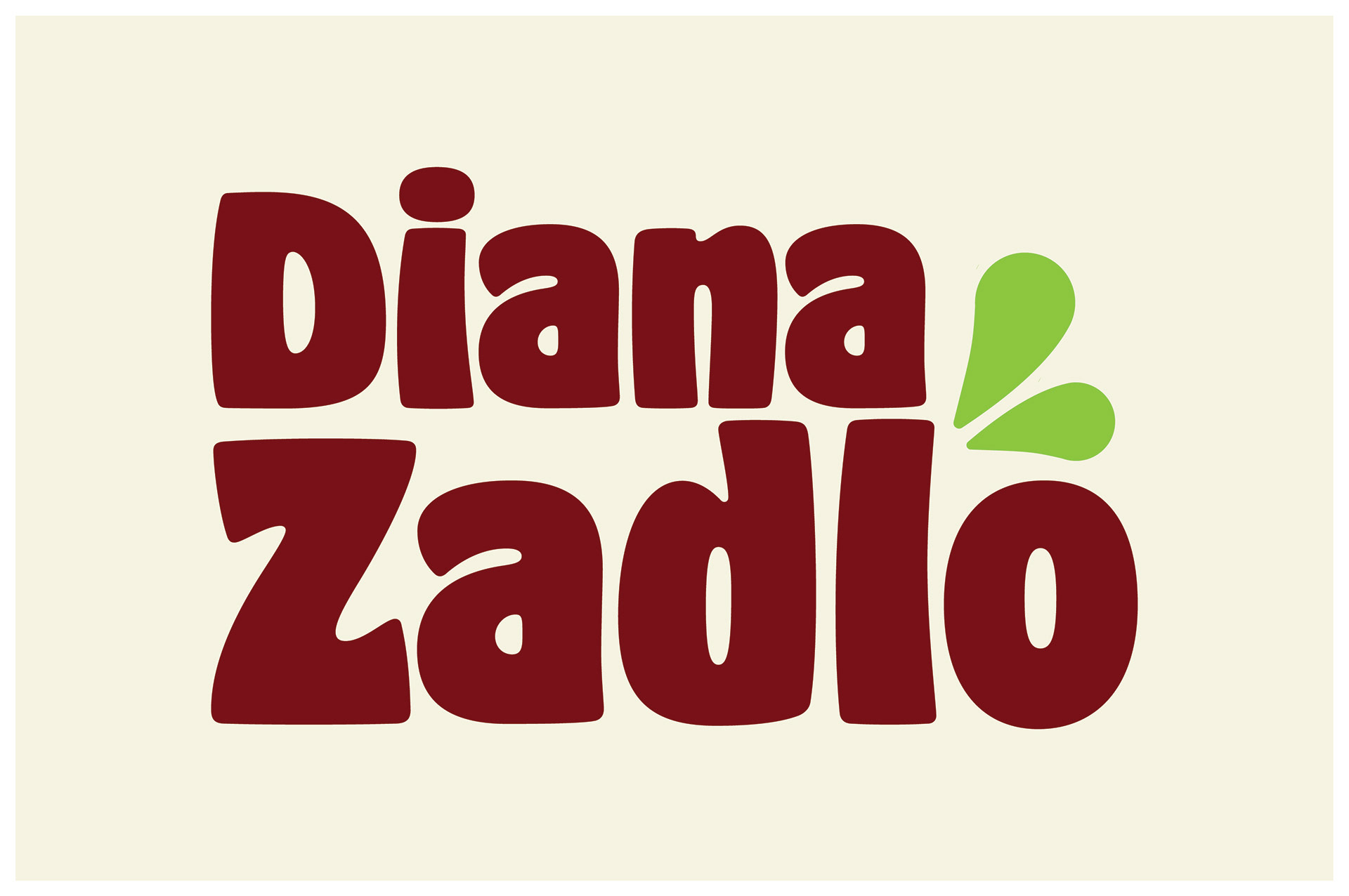
One of our first decisions was determining which alias would be the most successful. Diana went by 2 different names: Diana Lee Zadlo and That’s It! During our experimental logo phases, my partner and I used both, however it was eventually decided “Diana Zadlo” would be the most successful and had the greatest potential.
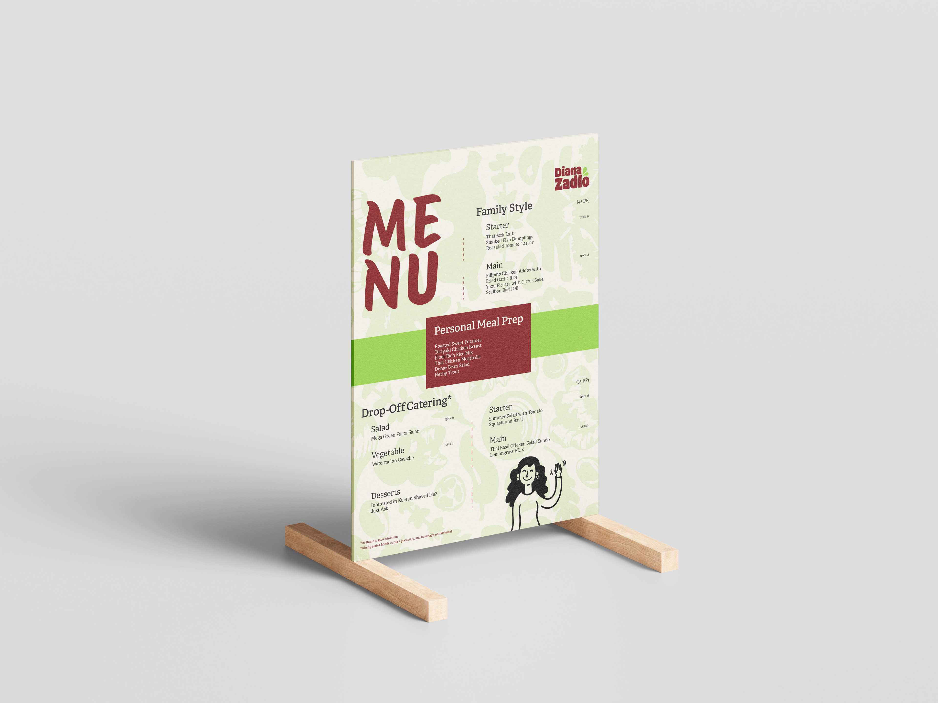
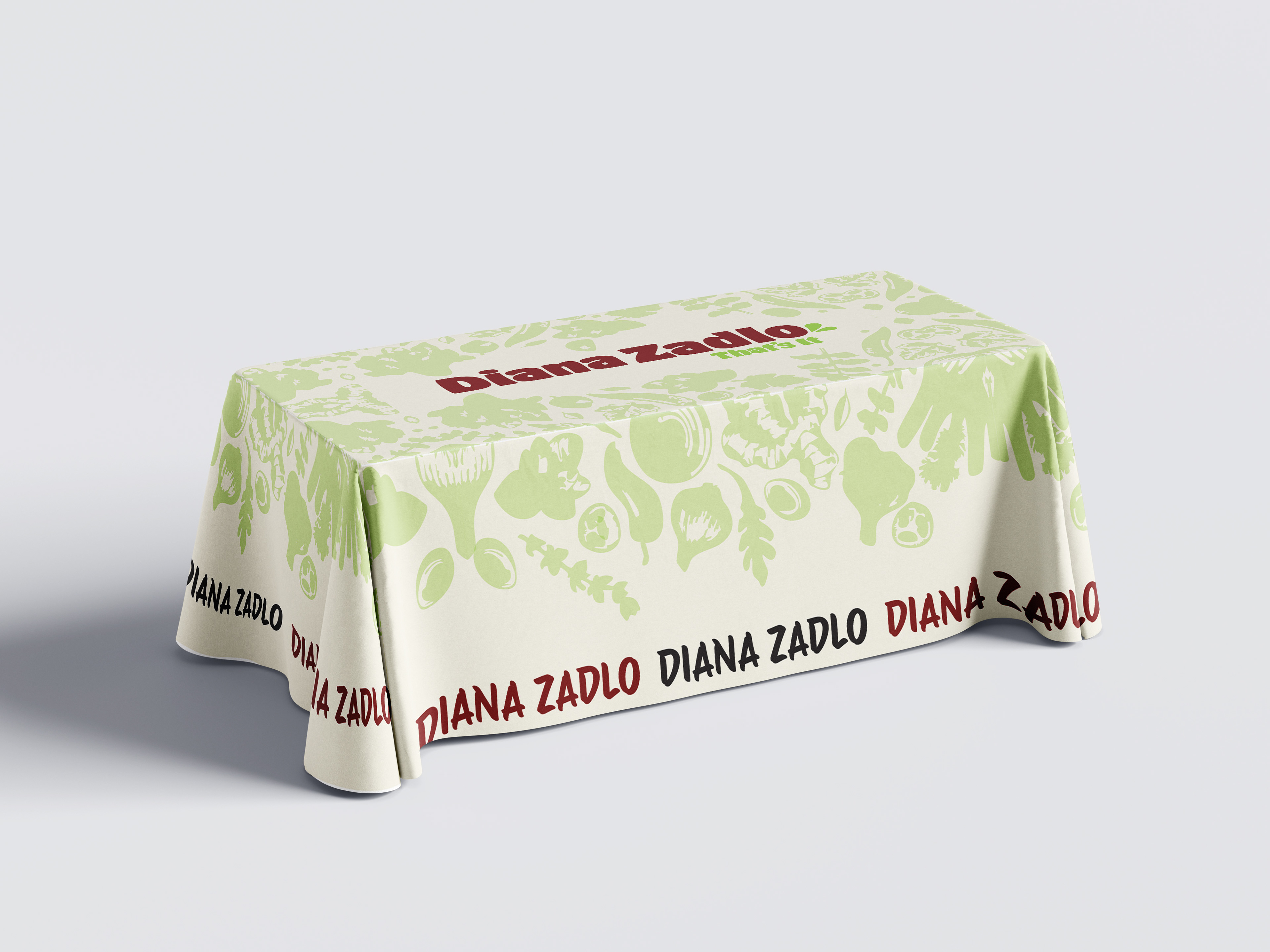
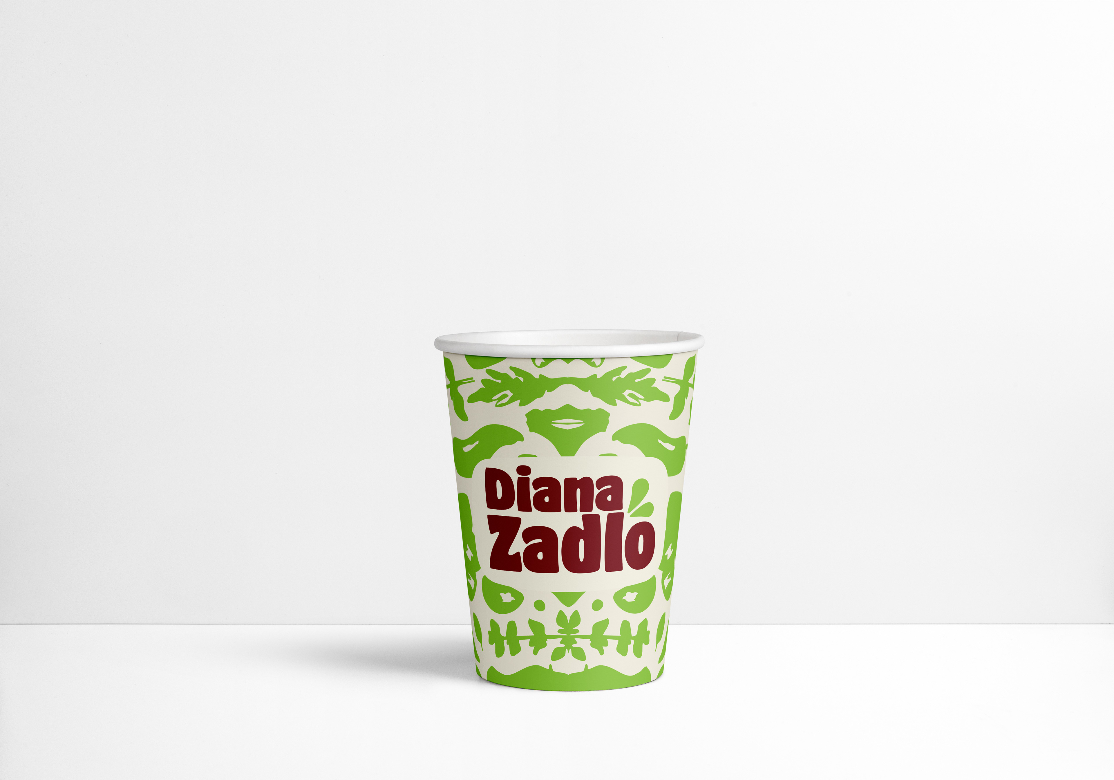
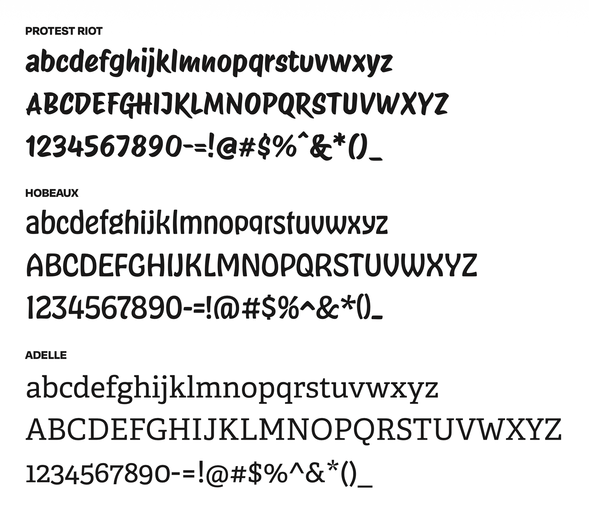
Following the decision of the client’s brand name, typography, iconography, and color palette was discussed. Typographically, my team aimed for a typefaces that were friendly and fun, yet professional and clear. Protest Riot, Hobeaux, and Adelle were chosen for their combination of professionalism and unique flare. Iconography in the preliminary stages oriented around nature, food, and utensils, which was symbolic of her desire to create nurishing and delicious food as a culinary artist. Our color palette was inspired by her healthy creations and bold personality.
Typography was determined using reference styles we wanted to emulate and Diana’s personal flare. It was imperative these fonts reflected our idea of the alternative, unique, yet professional brand that is Diana Zadlo.
One of our first decisions was determining which alias would be the most successful. Diana went by 2 different names: Diana Lee Zadlo and That’s It! During our experimental logo phases, my partner and I used both, however it was eventually decided “Diana Zadlo” would be the most successful and had the greatest potential.
Following the decision of the client’s brand name, typography, iconography, and color palette was discussed. Typographically, my team aimed for a typefaces that were friendly and fun, yet professional and clear. Protest Riot, Hobeaux, and Adelle were chosen for their combination of professionalism and unique flare. Iconography in the preliminary stages oriented around nature, food, and utensils, which was symbolic of her desire to create nurishing and delicious food as a culinary artist. Our color palette was inspired by her healthy creations and bold personality.
Typography was determined using reference styles we wanted to emulate and Diana’s personal flare. It was imperative these fonts reflected our idea of the alternative, unique, yet professional brand that is Diana Zadlo.
Our Process
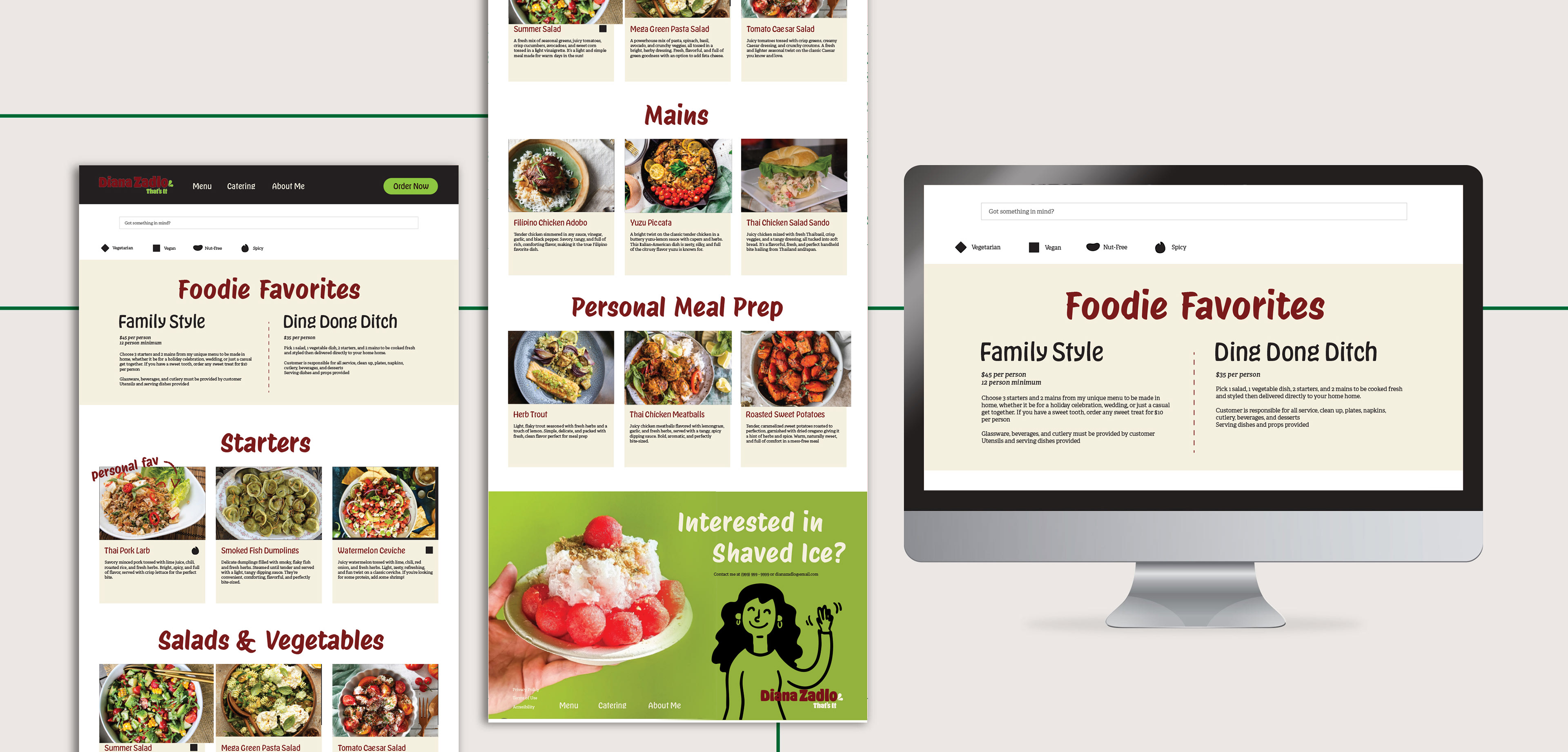
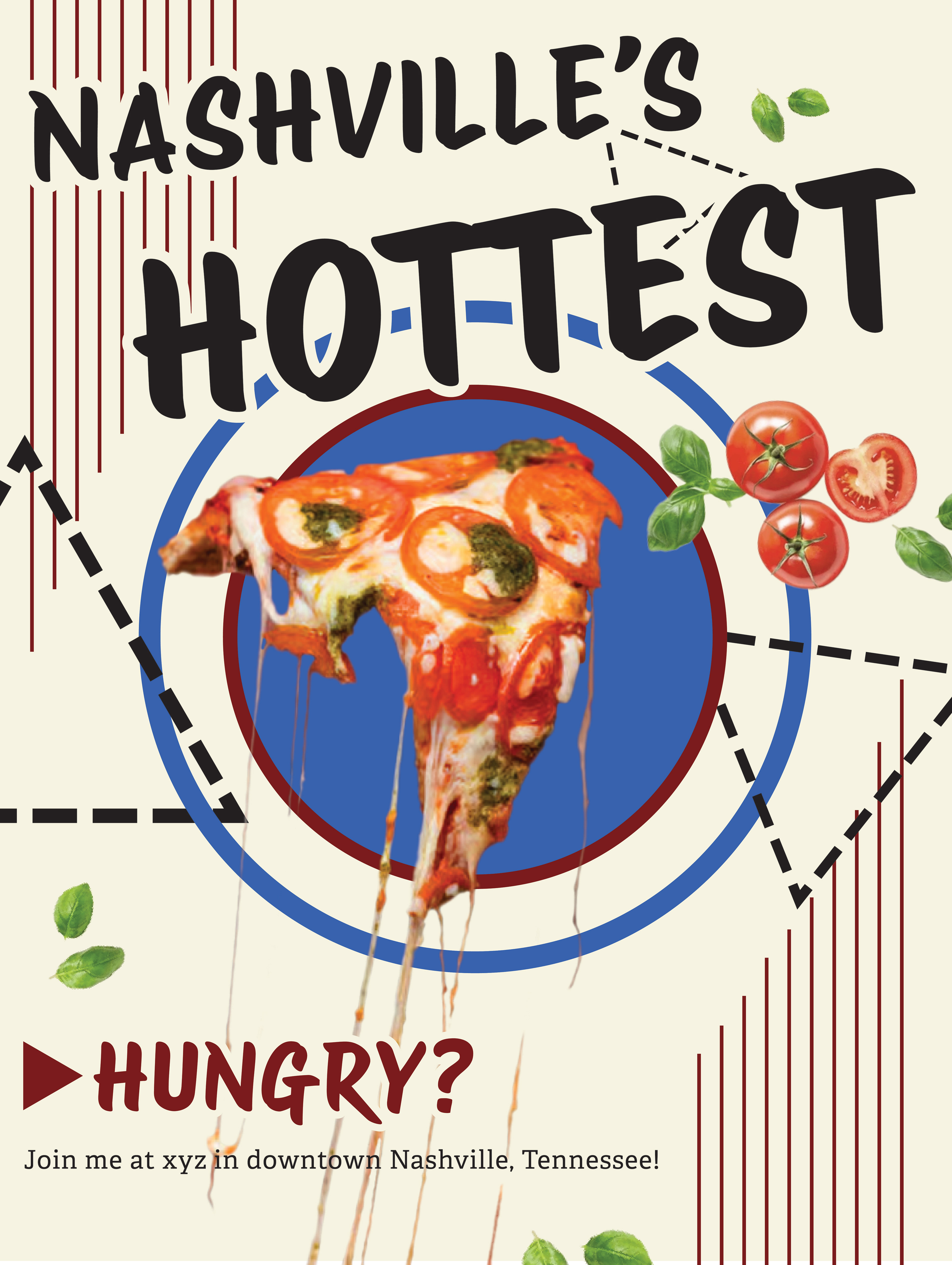
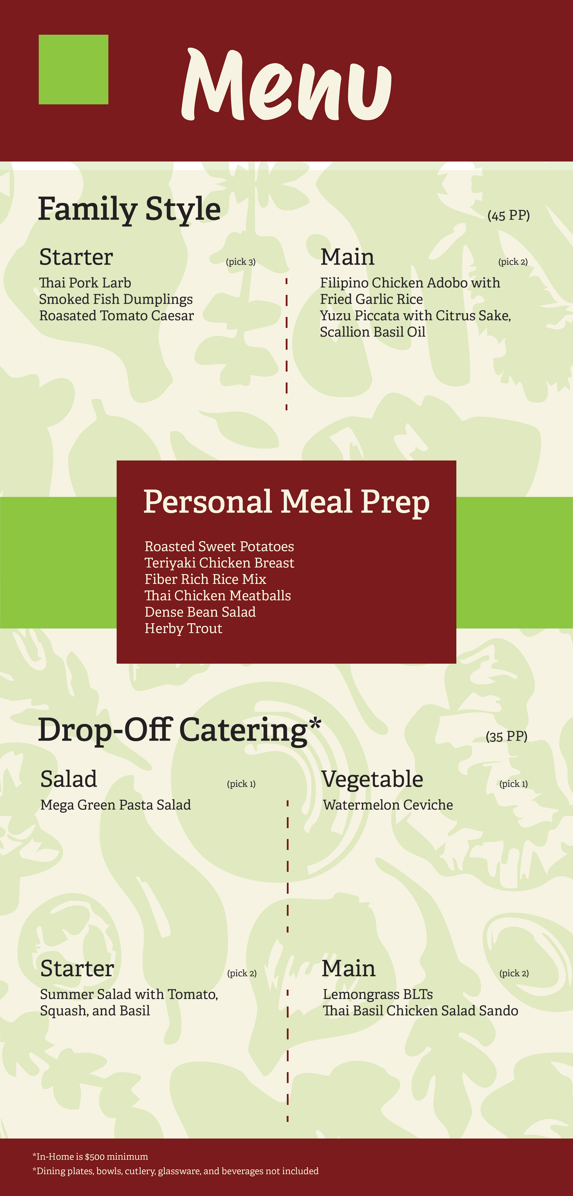
Other than finalizing logo designs, some of the first designs we worked on were the menu and poster designs. Although rudimentary, these designs gave us the foundations for our finalized products.
Much of mine and my teammate's time was spent in Adobe Illustrator aligning type, color coordinating aspects, and rearranging compositions, and some of it was also dedicated to photo editing in Adobe Photoshop. During our discussions and the few days prior to finalizing, Kyle and I used Figma to insure cohesiveness and to communicate our perspectives on the project. This was also where a schedule was created to ensure we both stayed on track, coordinated designs, and kept each other accountable.
Our Product
Our deliverables consisted of:
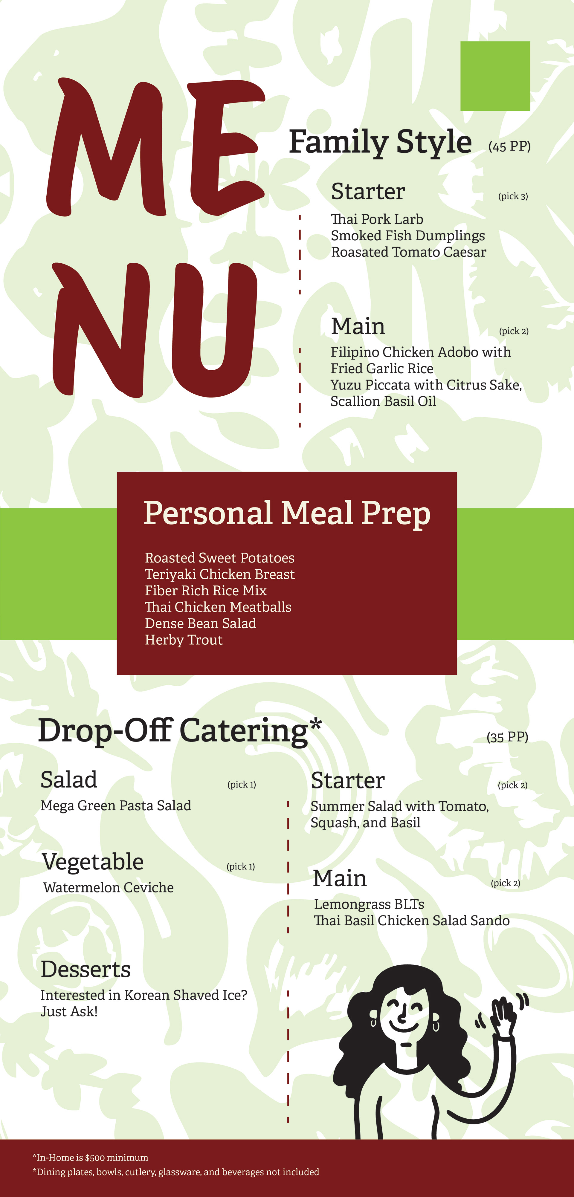
1 Menu
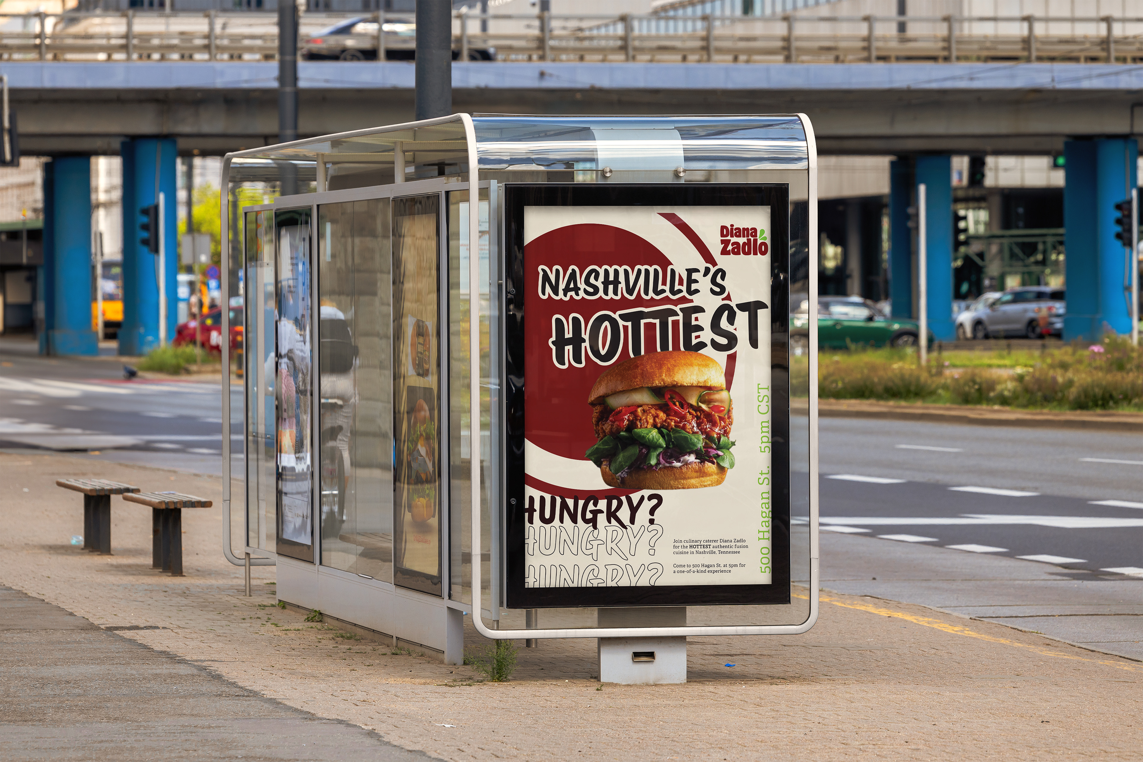
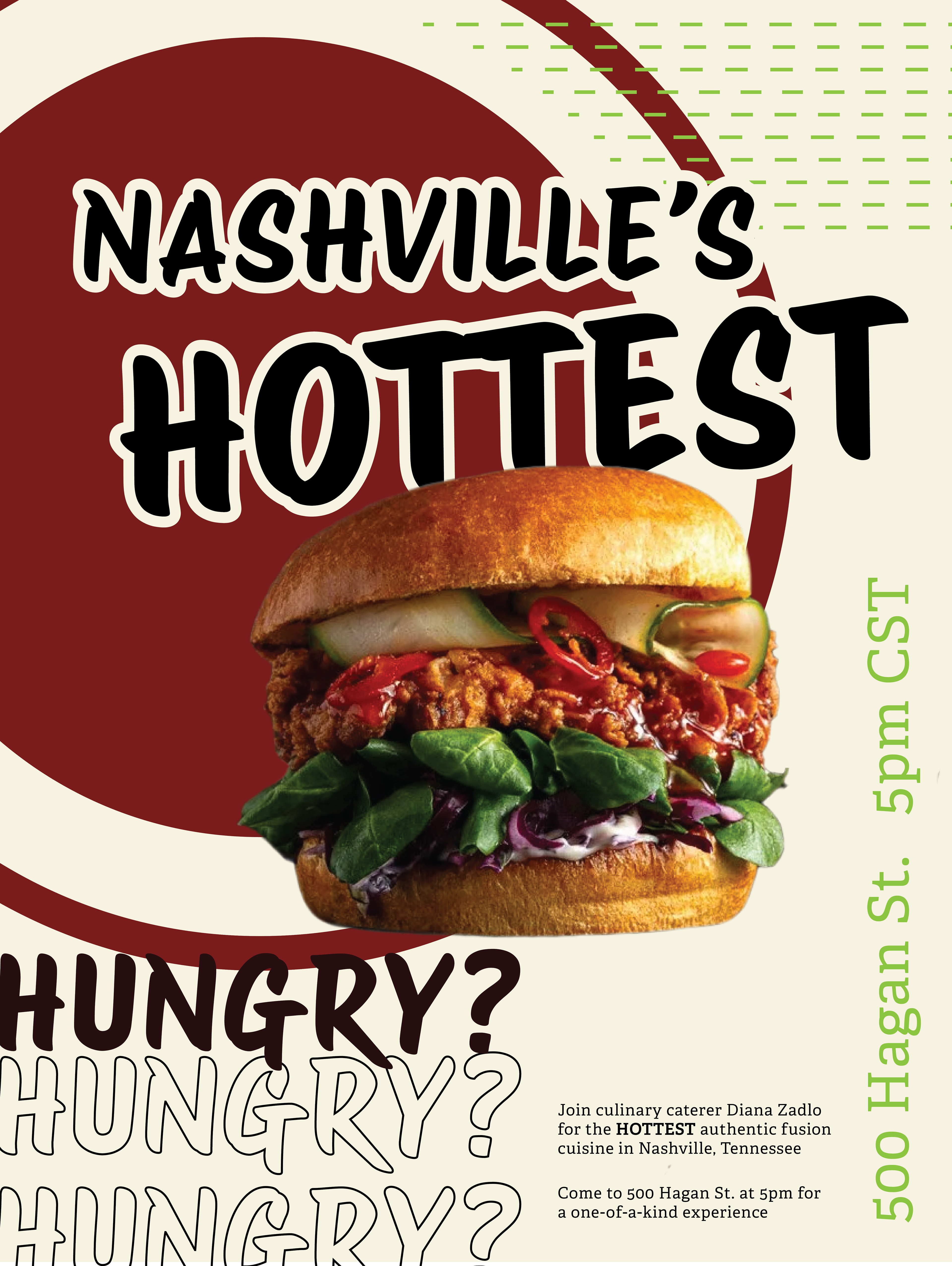
1 Poster
3 Page website pages
1 Social media post example
2 Logo variations
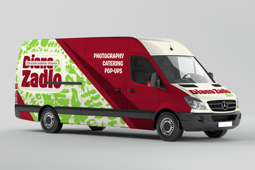
A few product designs like cups, table cloths, and even a food truck, since Diana is always on the go.