
Project Type Programs
Overview
Packaging Design Adobe Illustrator
Adobe Photoshop
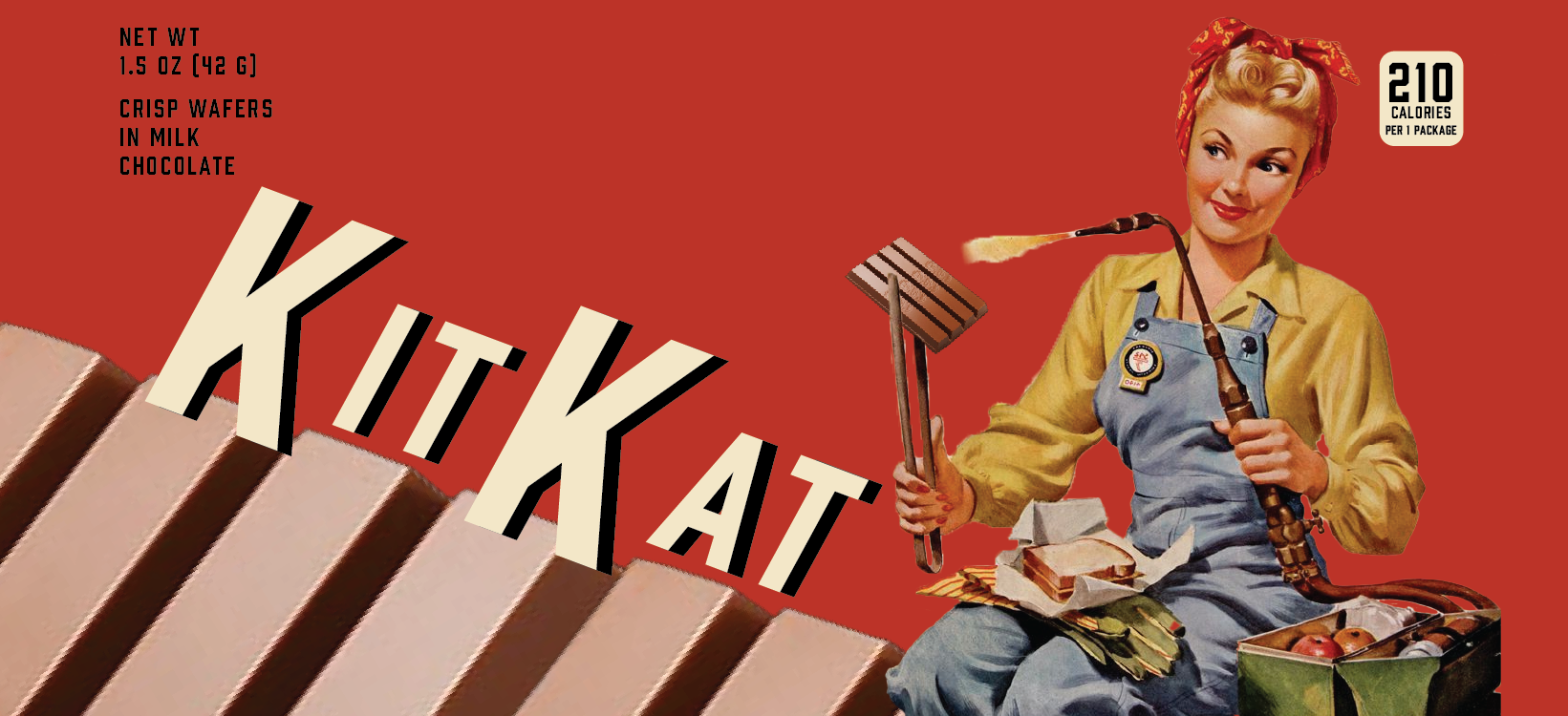
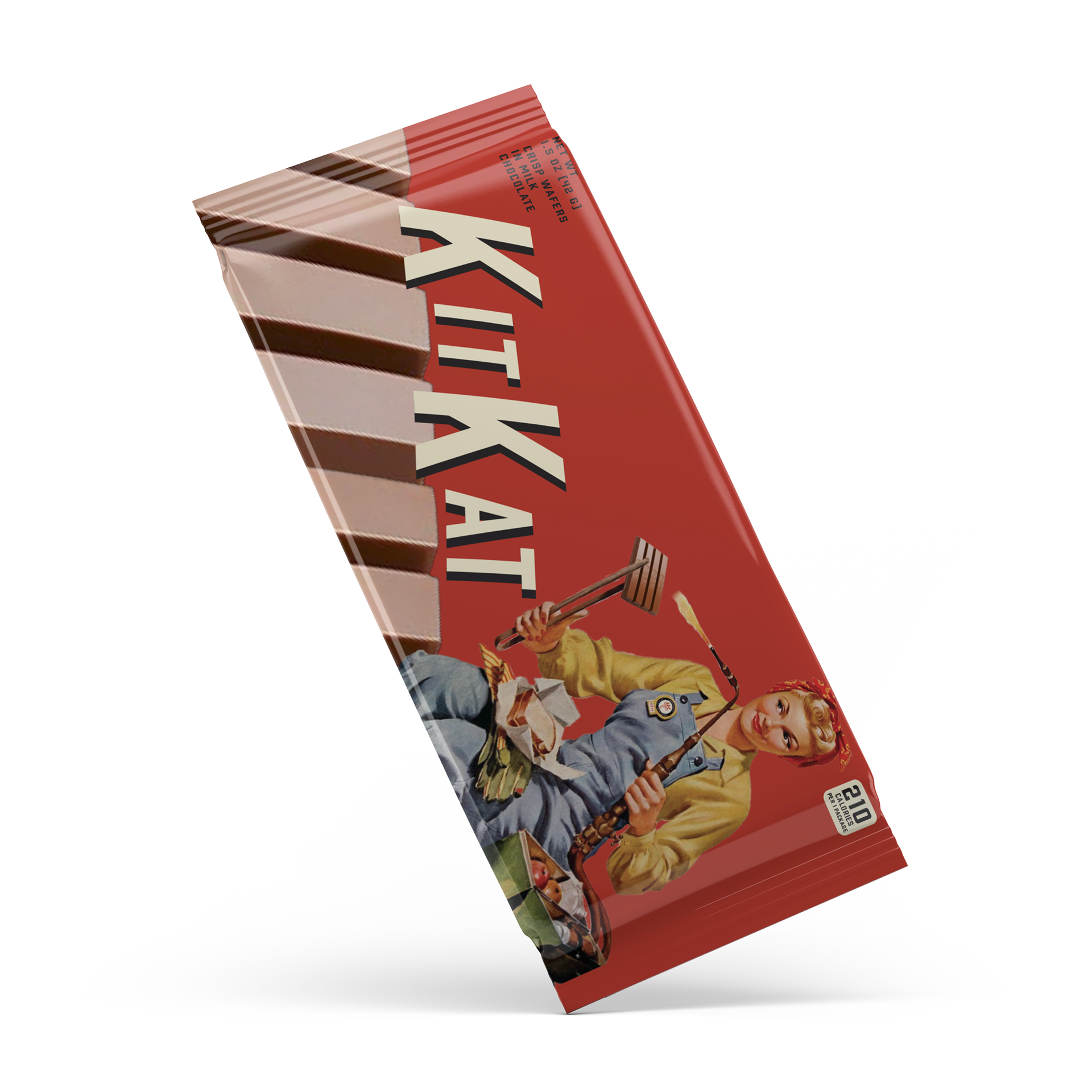
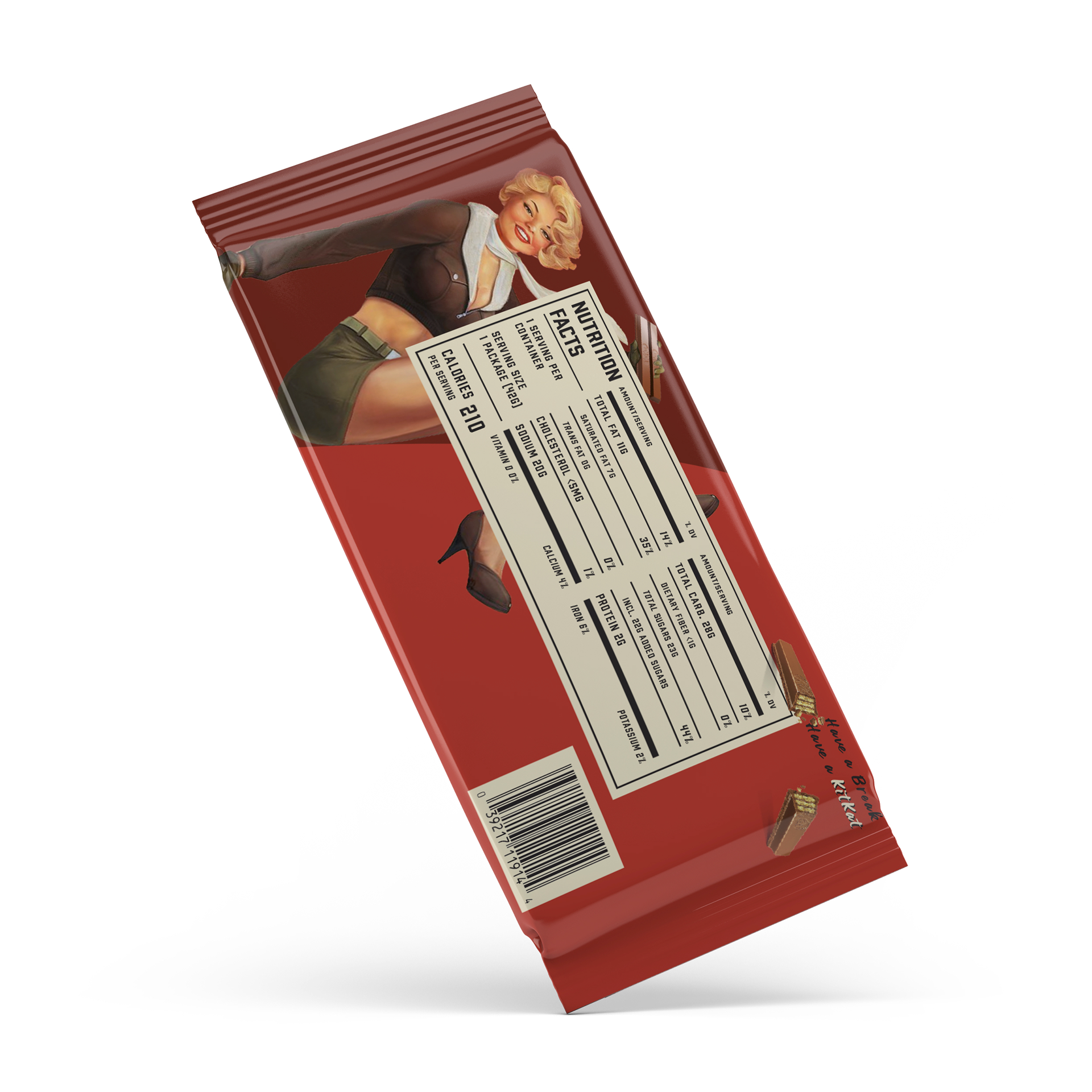
A digital and physically accurate KitKat packaging design created in heroic realism, a style popular in the 1930s and 1940s.
The Concept
My goal was to create a stylistically cohesive, visually interesting, and physically accurate design for the candy bar KitKat using a style called Heroic Realism in 4 weeks.
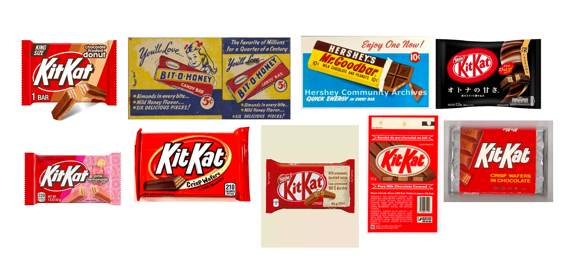
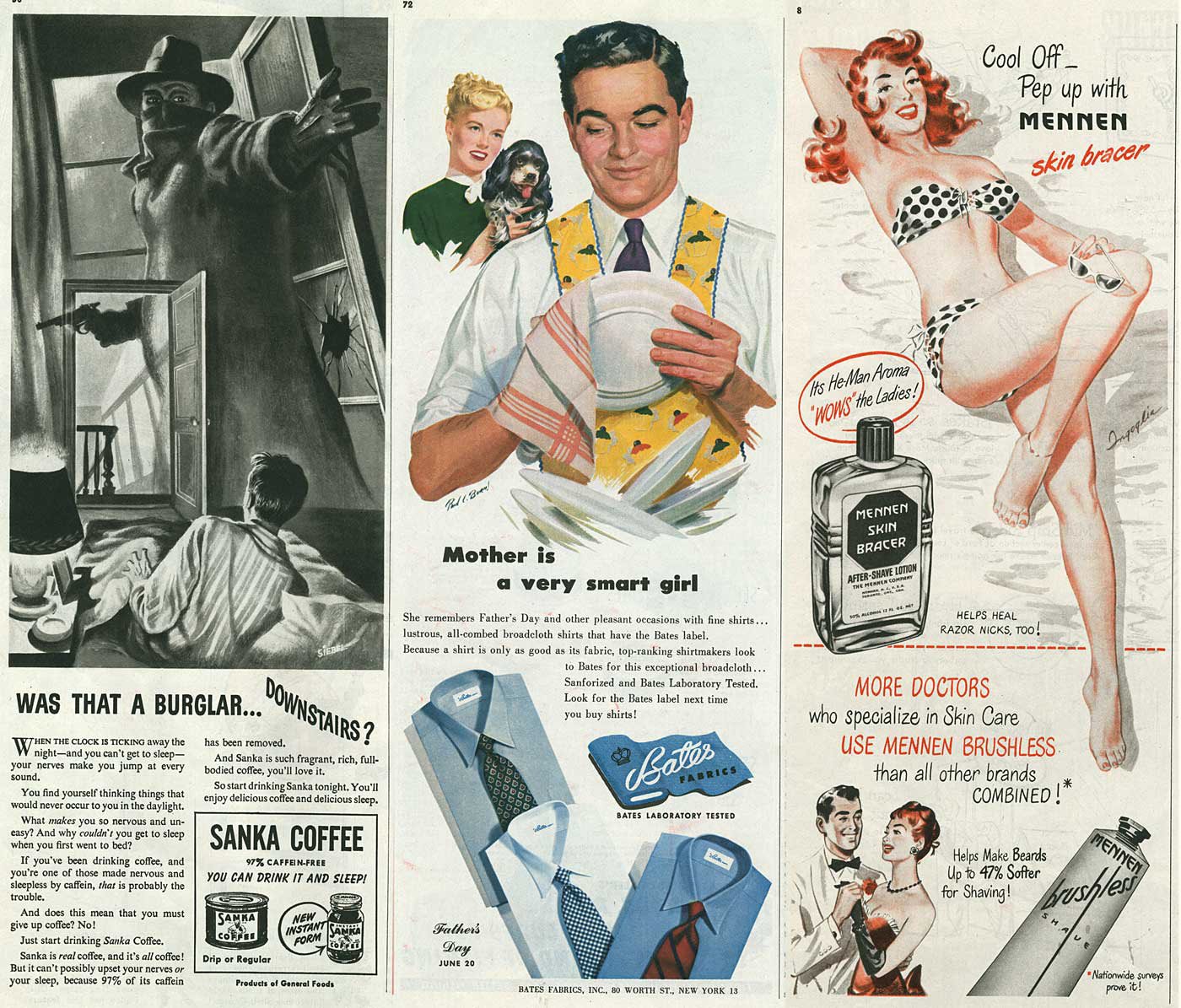
I started by collecting artistic inspiration from the time period of heroic realism as well as common candy bar designs from almost a century ago. Heroic realism was characterized by idealized and propagandized depictions of larger-than-life figures used to promote strength, labor, and ideology during wartime in the 1930s and 1940s. Bold primary colors and stylized realistic illustrations were common genre conventions. Different flavor / package variations of KitKat bars were also collected to gain a sense of how KitKat designs their packaging.
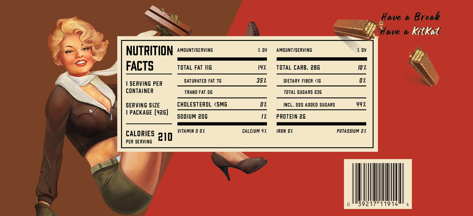
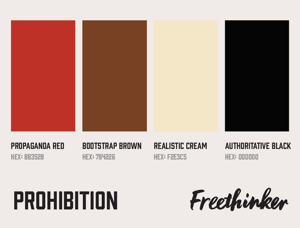
Next, I settled on a color palette and 2 typefaces. Red and brown were chosen to maintain consistency with the brand, cream was inspired by the heroic realism style, and black was used as a basic high contrast color. For the typefaces, I decided upon a blocky and rigid font as well as a script font that emulated a handwritten font with brush strokes and imperfect letters. They embodied 2 opposing sides and provided contrast typographically to the design.
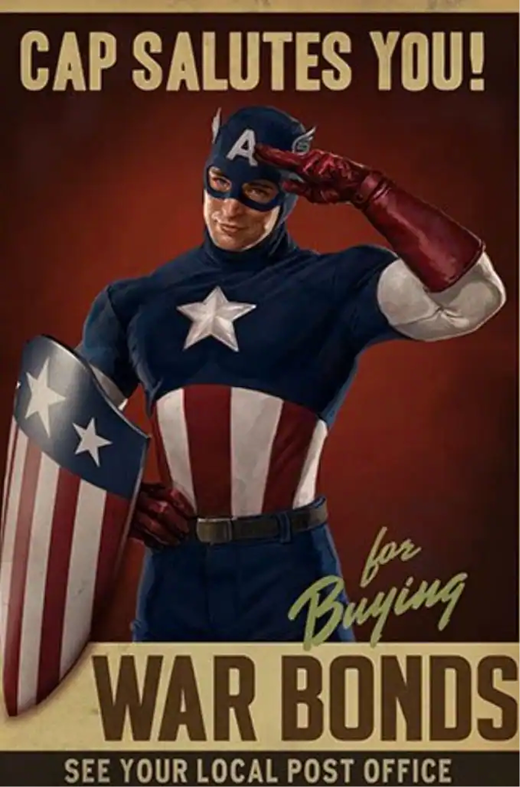
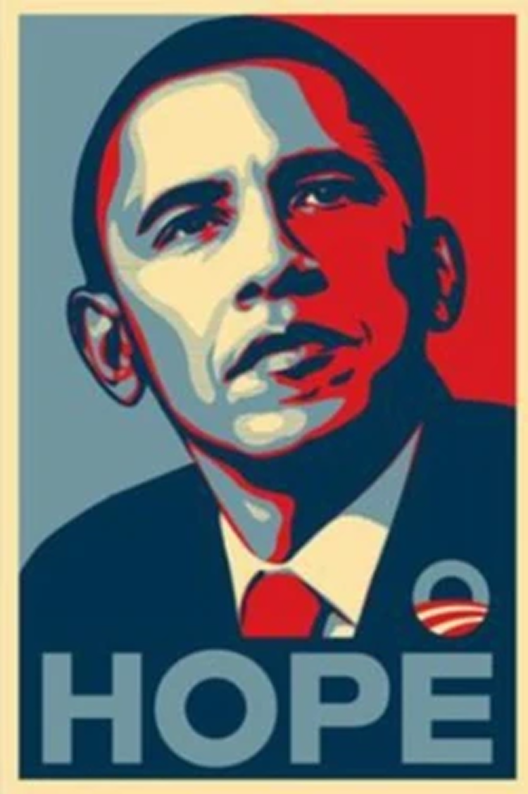
Popular modern artistic imitations of this style include the Marvel's Captain America war bonds design and former president Barack Obama's HOPE poster designed by Shepard Fairey in 2008.
The Process
To determine the size and dimensions of my design, I used a (recently eaten) KitKat wrapper and carefully measured the length and width of the design, height of the body copy, and logo. Using a mathematical equation, I converted my values to font sizes. This would ensure my designs could realistically be replicated from digital to physical prototype.
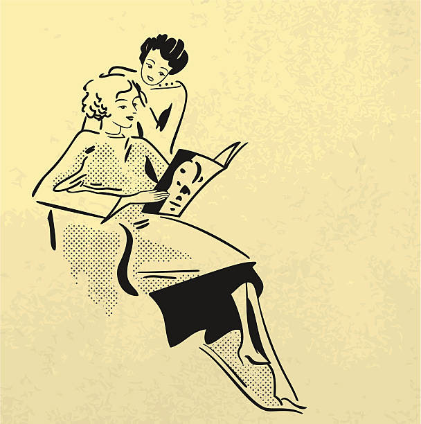
During my process, I experimented with several illustration styles. The illustrations were a pivotal component, because it was the focal point of heroic realism, so finding the right art was crucial. Eventually, I found wartime posters featuring working women and pin-up girls used as propaganda and / or advertisement, which is where the featured illustration of my final design derived from.
The angular nature of KitKat inspired me during my experimental phase with typography and layout, and I realized I could use the sharp edges and uneven letters to my advantage to create a more dynamic design using the edge of a KitKat bar. This idea would combine the 30s-40s style with designs that were similar to preexisting KitKat bars. To maintain continuity with the KitKat brand, I also made sure to include their "Have a break. Have a KitKat" slogan.
The Product
Once polishing the flat design, I placed it into a digital mockup to simulate a manufactured KitKat bar. After a bit of tweaking on the flat design to increase legibility, my Heroic Realism KitKat was complete.
All dimensions and nutritional information are accurate and true to scale.